
¶ Busy symbols, spinning wait cursors, spinning wheels of death or spinning beach balls. Small symbols indicating an uncertain state. Putting you on hold. Symbols never longed for. Symbols indicating that the software on the other side of the screen is busy working. Also the symbol of buffering, as discussed in Waiting for Events. It has different guises depending on the graphical environment for which it is designed. Apple has got its version, Microsoft another, and so on.
¶ The spinning wait cursor is a graphical element that should help the user of the interface. To give a cue that at the (hopefully short) moment there is nothing to be done. Wait and hope that the technology will do its job, that the developers of the technology did their job, that the infrastructure is properly at work and in place. It is also the symbol indicating the opposite of smoothness. Indicating that a system or configuration does not have the quality and complete capacity to work without any sudden changes, interruption, delay or difficulty. Therefore, the spinning wheel is a good starting point to reflect on smoothness, and the ends of it. What is the role of smoothness in design, in digital culture and in the experiences of technology?
¶ At the beginning of 2019, Swedish payment provider and bank Klarna launched a marketing campaign together with Snoop Dogg about smoothness. The idea was that the rapper was about to rebrand himself as Smoooth Dogg.
¶ For some time Klarna had been branding themselves as providing smoooth financial services. This is how the company descibed themselves in 2019:
It’s all about smoooth (yes, with 3 ooo’s). Klarna is Europe’s leading payments provider and a newly-licensed bank, which wants to revolutionise the payment experience for shoppers and merchants alike. Founded in Stockholm, Sweden, in 2005, the fintech unicorn gives online consumers various options to pay later — offering trusted, frictionless and smoooth checkout experiences.
https://www.klarna.com/international/press/smoooth-dogg-and-klarna-release-unique-collection/
¶ Frictionless and smooth experiences. A way to attract and maintain customers and users. That had been the branding hallmark, not only for company Klarna, but for a number of stakeholders delivering various kinds of digital services. A good example is how Apple in 2017 tried to make Android-users switch to iPhone, using the “smooth-argument”:
¶ The smoothness that Apple tried to promote and associate their products with was an experience without glitches, lagging visuals or distorted sound. To achieve such a smooth experience, there have to be an effectively working infrastructure and organisational ecosystem in place. An infrastructure that operates beneath consciousness and beyond the awareness of the users. Smooth and frictionless. This is achieved through obfuscation and blackboxing of several of the operations taking place beneath the interface, under the hood, behind the curtain or elsewhere, at faraway warehouses and datacenters. Smooth experiences require smooths operations.
¶ Connections have to work, software have to be effectively coded, compatibility in place. If here should be some small interruptions, these should be communicated, eg. through a spinning wait cursor. Otherwise, the lack of smoothness will be worrying. The lack of smoothness indicating an unexpected event that the providers of technologies and services either didn’t want to communicate or that they didn’t have the ability to control or to know anything about. To generate an experience of smoothness and trust in technology use some things are required. There is an immediate connection between the workings and non-workings of hidden or distant infrastructures and the design of concrete small user interface elements.
¶ Smooth experiences are not only dependent on working infrastructures and systems, they are also generated through minute and inconspicuous levels of UX (user experience) and interface design. The very look and feel of buttons and other interface elements are extremely important to evoke experiences of smoothness. All interface elements should react as expected. Look, appear and change according to expectations. Even small discrepancies and deviations from expectations can make something feel awkward, annoying or cumbersome.
¶ If we look at interface design, we can see that what is experienced as smooth, good and pleasurable designs change depending on context and zeitgeist. A pleasurable interface 2020 does not look as it did 2000 or even 2015.
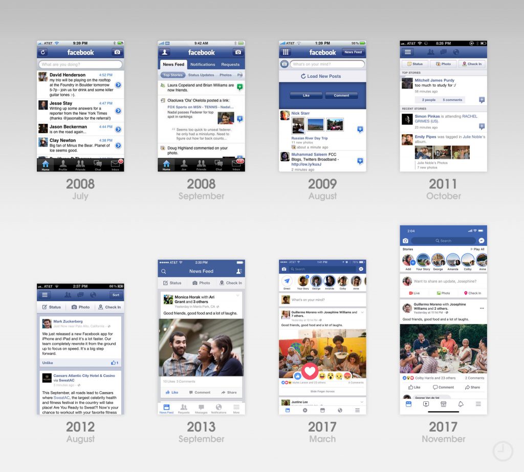
¶ The interval between upgrades and design changes varies between products and providers. The Facebook-app is eg. changed with ever shorter intervals, while other software can look the same for years. In whatever way, when we revisit an older graphical user interface it often looks or feels slightly awkward.
¶ Within interface design and UX, a trend during the last decade have been the move away from what is called skeuomorphic design towards flat design. Skeuomorphic design is based on the idea to mimick the form, shape and qualities of an object from another medium or the physical world in a new context, like on the screen of a smartphone. The flat design is instead minimalist, with clear edges and no illusion of 3D or spatial depth, except for sometimes a discreet shadowing to enhance contours. A button looks like a surface and not an illusory knob or object popping out from the screen.[1]

¶ According to Wikipedia: “The term skeuomorph is compounded from skeuos (σκεῦος), meaning “container or tool”, and morphḗ (μορφή), meaning “shape”. It has been applied to material objects since 1890 and is now also used to describe computer and mobile interfaces.”

¶ When it comes to graphical design in digital environments such as smartphones and computers, Apple has been a point of reference for some years. Until 2013 Apple-interfaces utilised skeuomorphic design to a high degree. Experience designer Iain Heath describe how it was the choice of CEO Steve Jobs and iOS inventor Scott Forstall to use design mimicking physical objects. This strategy made it easier for people to embrace the iPhone and to comprehend the new experience of smartphones. Skeuomorphism was used to create a smooth transition for new users, by referring to earlier things, technologies and milieus.
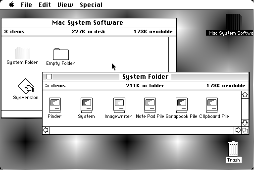
¶ This was not a new strategy. Earlier digital graphical environments had also to a high degree used skeuomorphs. References to earlier things have been widely used since the first graphical user interfaces (GUI) in the 1980’s, most notably through the office metaphor, including props like desktop, folders and trashcan.
¶ Skeumorphs have had its proponents and critics. It has sometimes evoked strong feelings. With the introduction of iOS7 in 2013, the so called death of skeuomorphism started at Apple. The new chief designer Jonathan Ive preferred more minimal designs, avoiding unnecessary ornamentation and references to historical products. As this happened several people were cheering. This is how the move away from skeuomorphism at Apple was described in The Guardian in 2013:
Loosely speaking, skeuomorphism means “making stuff look as if it is made of something else”. In this context, it is the logic that dictates that Apple’s iBooks app resembles a cheap pine bookshelf, for example, and its Notes app resembles a yellow legal pad with lines and a margin – of the type last seen in about 1978.
Look closely, and skeuomorphism is all over Apple and other user interfaces – the little shadows cast by windows, the highlights on virtual buttons designed to make them look shiny, like real buttons. Originally this was to help us neanderthals make sense of the dazzling new technology before us, as in: “Oh, I get it. That looks like a button, so I’m meant to push it.” But Apple got skeuomorphism-drunk, plastering the screens of its futuristically minimal devices with incongruous faux wood, leather and green baize. It got ugly.
https://www.theguardian.com/technology/shortcuts/2013/jun/12/skeuomorphism-apple-ditched-ios7
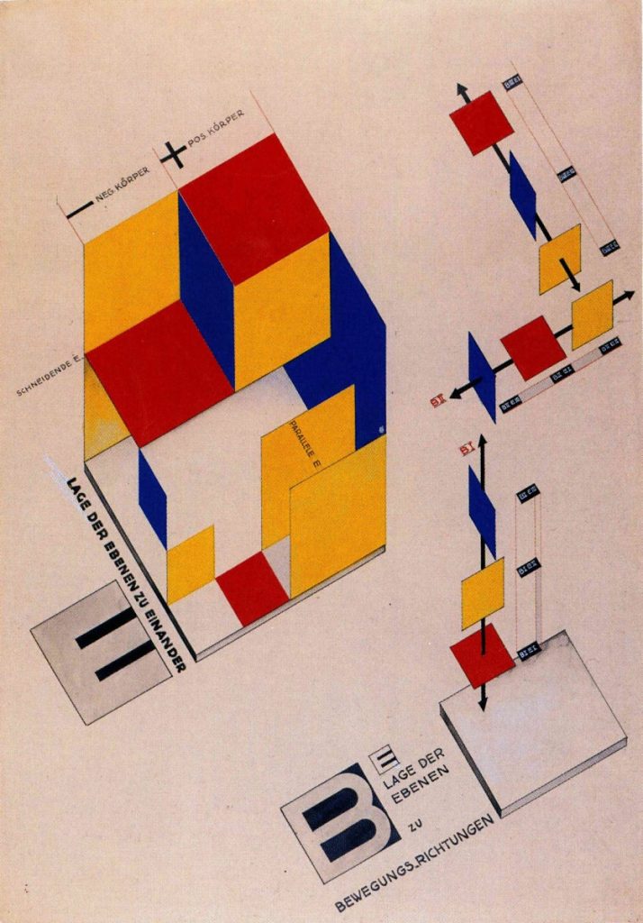
¶ The flat design could be experienced as more tasteful, and smoother. Maybe also more future-oriented, no historical references. Or? Maybe it was actually retro-future-oriented. Evoking associations to early modernism, maybe to the simplified forms, the rationality and functionality of the German art school Bauhaus during early 20th Century.
¶ The omission of unnecessary detail could maybe also be associated with Adolf Loos, architect, based in Vienna and active during the early 20th Century. He strongly advocated architecture without clutter and ornamentation. In his lecture from 1910, Ornament and Crime, he took thoughts about evolution as the point of departure to explain how humans went through different stages that led them away from primitive ornamentation and towards more sophisticated designs characterised by smooth and clear surfaces. Loos thought that the progress of culture could be associated with the deletion of ornament from everyday objects. According to him, it was therefore a crime to force craftsmen or builders to waste their time on ornamentation that would soon become outdated, out of fashion and obsolete. To Loos ornamentation was totally unnecessary. Just confusing, messy, in a muddle. Not smooth at all.

¶ Adolf Loos was one among several apostles of budding modernist sentiments and visions about a streamlined and no-fuzz future. The clear, the functional and the uncluttered started to gain traction in everything from city planning to interior design, and some decades into the century, the domestic area was the place where smooth efficacy should be implemented. The rational, clean and uncluttered household became an ideal in The Western world. According to modernist literature- and culture-scholar Victoria Rosner:
Changes in the routines of domestic life were among the most striking social phenomena of the period between the wars. The home came into focus as a problem that should be solved: re-imagined, streamlined, electrified and generally cleaned up.
Rosner, V. (2020). Machines for Living: Modernism and Domestic Life. Oxford University Press. Page 2.
¶ In Sweden initiatives to streamline domestic work and home design accelerated from the mid of the Century. HFI (The Institute of Home Research, in Swedish. Hemmens forskningsinstitut) was founded 1944 by housewives, and the domestic science teachers’ association together with the public institution Aktiv hushållning (Active Housekeeping).[2] They were working for active rationalisation of domestic work, and the methods were based on systematic research, time studies and minute observation of domestic work. Benches should have the ergonomically most suitable height, electric appliances should replace manual work, the layout of the kitchen should provide smooth movements and work. Not one unnecessary step should be taken in the well-planned kitchen. It should also be hygienic, electrified, standardised and efficiently smooth.
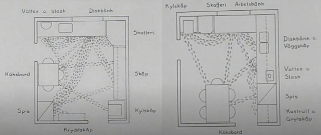
¶ The machine-like home promoted by organisations like HFI was built on certain assumptions and norms. The kitchen was almost like a laboratory. It was also called laboratory kitchens in Sweden, something ethnologist Lars-Eric Jönsson write about in a chapter about houses and architecture as empirical sources.[3] The kitchen was also built mainly for one person working in the kitchan at a time. The norm during mid-20th Century was also that this person was often a woman, a housewife. The kitchen should be a smooth and effective place for domestic work, well-planned and organised for the working housewife.
¶ The standardisation and planning measures of kitchens were still part of the discourse on domestic spaces in Sweden in 2020, even if the rhetoric didn’t have the same focus on scientific management and industry-inspired effectivity. Instead, it were the styles, designs and concepts provided by various commercial providers of kitchen-interiors and home-ware that characterised the discourse on domestic design. You could choose to design a kitchen inspired by a French bistro, an old farmhouse, loft living, a restaurant or a no-fuzz 1950’s HFI-kitchen. Even if the modern and the streamlined was not explicitly dominant in the selling arguments, you would not find a merchant selling a kitchen that was not described as efficient, well-planned and implicitly smooth to work and live in. In 2020 you were, like in 1953, not supposed to take one single unnecessary step while working in the kitchen or for that matter in other parts of the home. To a high degree, the smooth kitchen had also become the smart kitchen. The idea about smartness in the intersction between home and technology is something that we’ll come back to in other Files.
¶ What about kitchen smoothness the design move that was taken by Apple and other companies for their graphical interface design? The move away from ornamentation and decoration to flat and minimal designs. Did that occur also in physical design for domestic spaces? If we think about the move from skeuomorphism to a more flat design as a kind of decluttering, then the answer is yes. In 2020, in a world of ubiquitous consumption, decluttering and minimalism were promoted as part of self-help, as a way to fulfill your life, as a way towards sustainability and the real good life. Techniques, guidance, tips and tricks were offered by persons/brands like Marie Condo, Joshua Becker or The Minimalists (Joshua Fields Millburn and Ryan Nicodemus).

¶ There were differences betwen the ways that minimalism, de-cluttering and smoothness in life were promoted and advocated. Some were adovating very practical design- and cleaning-tips, others were more oriented towards spiritual transformation or towards suggesting people to “simply” live a more meaningful life.
¶ Wishes for minimalism and a simpler life has been around probably as long as people have experienced abundance and excess. In The Longing for Less, Kyle Chayka discuss today’s minimalism-trends and relate them to a number of earlier examples, like Henry David Thoreau’s escape from modern life into a cabin in the woods in Walden in the 1840’s, John Cage’s art and music as well as 1970’s minimalism-proponent Duane Elgin, who at the time wrote Toward a Way of Life That is Outwardly Simple, Inwardly Rich. From a US-perspective he also reflect on how ideas about individual accomplishments maybe has made US-citizens more vulnerable to minimalism-gospels.
The United States is particularly vulnerable to the charms of minimalism. Something about our belief in the power of self-definition and starting over suggests to us that if we only sweep our floors we will magically become new people, unburdened by the past. Maybe it started with the iconoclastic act of throwing tea off the boat in Boston Harbor, or it’s the misperception that the country was simply blank space before the Pilgrims came from England and the pioneers headed west to occupy Native American lands. We like to think that we can do without, rough it to prove that we’re not so soft or bound to the past, In fact, we’ve gone through a few nationwide cleaning fugues before Kondo.
Chayka, Kyle (2020). The Longing for Less: Living with Minimalism. New York: Bloomsbury Publishing. Page: 1-IV.
¶ There are national, social and cultural differences in how ideas like minimalism spread and become popular. The conditions in Sweden and US is different, while some things might be similar. Minimalism has a number of variations, meanings and shapes. Chayka reflect on why the concept and the ideas had taken hold. He noted that:
Minimalism, I came to think, isn’t necessary a voluntary personal choice but an inevitable societal and cultural shift responding to the experience of living through the 2000s. Up through the twentieth century, material accumulation and stability made sense as forms of security. If you owned your home and land, no one could take it away from you. (…) Crises following crises; flexibility and mobility now feel safer than being static; another reason that owning less looks more and more attractive.
Chayka, Kyle (2020). The Longing for Less: Living with Minimalism. New York: Bloomsbury Publishing. Page: 1-II.
¶ This analysis could hold true when it was written. Then came the Corona-crisis, with quarantine, extensive restrictions in mobility. People cocooning in their homes. If they had one. Now real estate and property became extremely important. Old school capital and possessions was what counted. A large living space, filled with stuff and things that could be used when you had to stay put, stay in your own place. These things counted. Ideas about property, value, “the good life”, convenience and smoothness shifts and changes with the times. Sometimes the shifts come abruptly.
¶ Ethnologist Orvar Löfgren has been studying how excess and order is conceived and practised in domestic settings for decades. He stress that it has always been a tension, what he calls a moral economy, emerging in relation to ideas about everyday overflow and how people handle and think about things. How much is enough? When and for whom? The present has always seemed to be more messy than friction-free futures, or for that matter more messy than simplified and sometimes idealised pasts. With the coming of the 21th Century, new digital technologies and the societal development was supposed to (finally) make domestic life smarter and smoother. But like so often, reality resisted.
Domestic life in the twenty-first century was supposed to be cyber-light and friction-free, thanks to all the new technologies that would simplify people’s lives. Most Western homes are, however, still veritable jungles of clumsy objects and gadgets, utensils and tools crammed into every available space. Cupboards and wardrobes may be bursting, cellars and attics cluttered. Little gadgets let out green or angry red blips in the kitchen, electric cords create jungles under the tables. People devote a large amount of energy and resources to handling this abundance; things are shuffled back and forth, rearranged, recycled. Every day, new objects enter and old ones are lost, forgotten or wasted, leaving by the back door.
Löfgren, Orvar (2015). The Black Box of Everyday Life. Entanglements of Stuff, Affects, and Activities. Cultural Analysis, 13, 77–98. Page 83.
¶ What is enough, what is preferable and smooth? Smoothness, as a concept, like simplicity, is not that smoothly defined. It is a word that we can use to better understand certain phenomena. In a short, witty and thought-provoking text, anthropologist Richard Wilk plays with the idea of using smoothing as the point of departure to design new concepts to understand culture. He present and reflect around cultural analytic concepts like realignment as a kind of cultural chiropractic, retrodiction as a kind of historical smoothing, folding up as a way of putting narratives and stories into smaller packages, or wrapping a process, concealing it inside another, and so on. Words can be used as vehicles for the imagination. Etymologically the very word metaphor can be traced to ancient Greek, and the meaning to transfer or carry across.
¶ When Wilk playfully discusses smoothing and ways to do cultural analysis with words, he starts the text by stating how all these attempts to describe cultural phenomena and processes, this smoothening, is unconditionally restricted by the fact that human practice is seldom easily defined, framed, streamlined or put in a neat box:
There is nothing regular, planned, symmetrical or consistent about culture; it has no geometry. Cultural processes of change are equally messy and unpredictable. Even in retrospect we rarely find trends over time which fit straight lines or simple logarithmic curves, and simple repetitive cycles are equally rare. From a contemporary standpoint, directions and trends are even more chaotic and difficult to discern. Every rule seems to have exceptions, no boundary is completely fixed, and culture seems to constantly burst out of whatever category we use to contain and describe it.
Wilk, Richard (2005). Smoothing. Ethnologia Europaea, 35(1–2), 23–27. Page 23.
¶ Cultural processes are hard to easily capture and convey. But we have to use the tools we have to better understand the world. The word smooth can be one such tool. It can, like several other words, also be an invocation or a call to action. The expression “Get smooth!” generate associations and imaginaries, it might lead to action, and it is coupled to ideas about values, moral, aesthetics and what is preferable. The smooth can be efficient, clean and organised, but also featureless and dull. There is a world of associations and practices opening up when thinking about what is smooth and what is not smooth in relation to technologies and how humans experience and imagine everyday life in different contexts.
¶ Let’s now move back to Klarna’s campaign with Smoooth Dogg. It plays with the polarities and variations of smooth, with the different guises of smoothness. Smoooth Dogg is not minimalist. It is extravaganza and frivolous spenditure. But this spenditure could be offered through a smooth interface, through smooth operations beyond the interface, at the backend.

¶ What did it take to get that Klarna-smoothness? Or that smoothness suggested by other stakeholders using digital technologies to offer services and products. In order to receive smooth experiences you have to take the offer. An offer that in 2020 was often presented in a GUI-window, where you simply had to click. To approve, confirm, agree, acknowledge. These clickwrap-boxes where you by a simple click could move on in a process were extremely common during the early 21th Century. They were used by major players like Google and Facebook, as well as by smaller ventures and organisations. But they all used the same logic… Subscribe, upgrade to premium, download, follow, be a customer or user, purchase. If you want smooth, then submit to services and terms. Submission by a simple action. Smoothly, with just one click.
[1] Like all trends and cultural phenomena, they are never clearcut, unison and totally homogenous. Skeuomorphism was still important in design in 2020. Trashcan, desktop etc. were still design elements in digital interface environments. Several software environments also used other detailed symbols from the world outside computers. But the trend away from skeumorphism was dominant among many “big players” like Apple. In 2019 the neologism neumorphism (or neomorphism) also appeared in UX-circles. Neumorphism was based on the idea of a quite minimal design that took some inspiration from skeuomorphism. Instead of totally flat design, buttons and other design elements were designed so that they looked like slightly elevated from the background, like embossed structures, giving the impression of depth and 3d without using all the details that dominated skeuomorphism from 10 years ago.
With Mac OS11, also called big Sur, Apple was also bringing back some skeuomorphic elements in 2020. Design trends and aesthetics do not follow any rulebound evolutionary path, as is sometimes imagined and proposed. It is an ongoing entanglement of reiterations, opposing trends, slow as well as abrupt shifts, and a plethora of parallel preferences and designs emerging, transmuting and disappearing in different social and cultural contexts.
Skeuomorphs also occcur beyond design practices. Sociologist Stefan Larsson has researched how metaphors and skeuomorphs are utilised and become crucial for the way law is practiced and conceptualised. In a study of the copyright case against the file sharing activities of The Pirate Bay, he show how the use of skeuomorphs became crucial for the outcome, see: Larsson, Stefan (2013). Metaphors, law and digital phenomena: the Swedish pirate bay court case. International Journal of Law and Information Technology, 21(4), 354–379.
[2] Brunnström, Lasse (2018). Swedish Design: A History. London: Bloomsbury Publishing. Page 88.
[3] Jönsson, Lars-Eric (2017). Byggnaderna, sakerna, arkivakterna. In: Jönsson, Lars-Eric, & Nilsson, Fredrik (2017). Kulturhistoria: En etnologisk metodbok. Lund: Department of Arts and Cultural Sciences, Lund University. (The chapter is written in Swedish)
Version History
V 1.1 August 5 2020. Part added about the norms of domestic work in the mid 20th Century kitchen. Also added reference to Lars-Eric Jönsson (2017).
V 1.2 August 19 2020. Added a reference to Stefan Larsson’s work on metaphors and skeuomorphs in relation to practices of law (under note 1.).