Categories
The Mundania Files

Large Numbers

 16 million is large number. It is used by Philips to promote their smart or intelligent lighting system Hue. The system was launched in 2012, and is one of several smart home-lighting systems. The system offers 16 million colours to choose from when you configure their light bulbs or lamps.
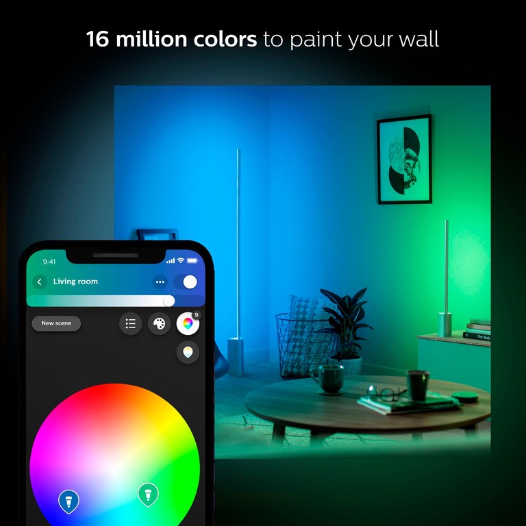
This is how the floor lamp “Signe” as part of the Hue-system is promoted.

 With products like Hue, the world of domestic lighting has become more complex. The customer get more varieties and opportunities to design lighting experiences and atmospheres than before. This however doesn’t mean that lighting or light design was something banal before. Electric lighting has always been more than the flick of a switch, more than mere button-pushing [1].

¶ The mundanised systems of electrical lighting is based on extensive infractructures and operations. In their employment of this infrastructure, people use light in often creative ways. Meanwhile they also depend on certain norms and unwritten standards, something anthropologist Mikkel Bille has pointed out in several projects. Lighting is more than technology with an aesthetic dimension, it should be understood as a deeply cultural and social phenomenon [2].

¶ When the 16 million colours are introduced in the marketing of Hue and in the offerings to customers, there are more choices and configurations to consider than ever before. The question is what this large number and choices might mean? Has domestic lighting become more advanced, more of a craft now?

The interface of the Hue-app offer different ways to control the lighting, setup and configuration of the system. One way to choose a color is through a color wheel.

¶ The number 16 million show what is possible. It also hints at the complexity and a proposed ingenuity of the system. But when it comes to using the system, the complexity is also combined with simplicity. Within digital cultures, a common way to navigate a system with a multitude of variations is through presets or templates. Some of these presets Philips have chosen to call Light Recipes. When they promote their recipes, they can use the large number of colours as the starting point to evoke imaginaries about lighting and the use of the Hue-system as a craft or science. This is how the light recipes are described:

Did you know… That our Light recipes (Relax, Read, Concentrate and Energize scene) are specially selected based on the knowledge from years of lighting research? By setting your Hue lights on a high color temperature like the Concentrate and Energize scenes you can reduce sleepiness and increase your alertness and concentration levels. While the Read scene gives you the perfect amount of light to read a book, the Relax scene helps you to wind down.

https://labs.meethue.com/news/get-back-into-the-swing-of-things-as-summer-comes-to-an-end-with-hue

¶ Here the system is promoted as advanced and as based on scientific knowledge and competencies. This is the hallmark of the smart home-ethos. The user has distributed smartness to systems that deliver through an obfuscated complexity. In the background, 16 million colours. At the front, scientifically crafted recipes. Like a mix between a medical precription offered to you by a professional doctor and a set of instructions given to you so you could achieve that perfect serving.

https://www.youtube.com/watch?v=4gypUEAXY0Y
Four Recipes.

¶ Let’s compare the Hue lighting experience to another automated experience. In one of the lunch rooms of Lund University, there’s a coffee machine. For some time it had a sticker attached to its front. It promoted the product by stating that the coffee from the machine had over 800 aromas. The number recur throughout a number of coffee-related places, such as artisan coffee outlets and other organisations dealing with coffee. 

¶ The number stems from sources stating that 800 discernible chemical compounds or components can be produced through the coffee making process. Roberto Zironi, professor of Food Industries at the University of Udine and chair of the scientific committee of the International Institute of Coffee Tasters write about the complexities of coffee aromas:

Coffee is a drink that expresses most of its sensory characteristics in its smell and its aroma. The aroma is the sensory characteristic resulting from a combination of smells contributed by the chemical substances and by their intrinsic synergies and is the result of high-quality raw materials and of technological steps for the processing of the green matrix into roasted coffee which are thoroughly carried out. It is important to point out that the aromatic precursors are already present in the green bean which, exposed to roasting, develops new substances that contribute to the complexity with more than 800 volatile components found in a cup of coffee.

http://www.coffeetasters.org/newsletter/en/index.php/the-markers-of-non-quality/06/

¶ 800 volatile components signals some requirements when it comes to coffee making and the raw material and equipment that is used. High numbers might require skill or good technologies. The complexities and sophistication of coffee is also symbolised through the Flavor Wheel, a resource for the coffee industry to provide a common vocabulary for sensory qualities and flavor of the beverage.
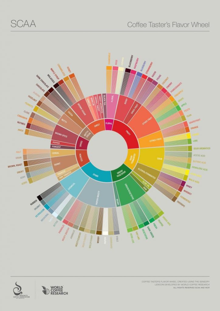
The Flavor Wheel is a tool to name and capture specific flavours of coffee. It uses various characteristics like smoky, fermented, medicinal. Or the association to elements and things beyond the beverage, such as rubber, petroleum, malt or nutmeg. From: Specialty Coffee Association of AmericaCC BY-NC-ND. See also: Spencer, M., Sage, E., Velez, M., & Guinard, J.-X. (2016). Using Single Free Sorting and Multivariate Exploratory Methods to Design a New Coffee Taster’s Flavor Wheel: Design of coffee taster’s flavor wheel. In: Journal of Food Science81(12), S2997–S3005. https://doi.org/10.1111/1750-3841.13555.

¶ The Flavor Wheel is a way to visualize and organise something as ephemeral as taste, aroma and flavour. The many categories together with the statement about 800 aromas or chemical compounds give a certain aura around coffee. According to Christopher H. Hendon:

Coffee is unique among artisanal beverages in that the brewer plays a significant role in its quality at the point of consumption. In contrast, drinkers buy draft beer and wine as finished products; their only consumer-controlled variable is the temperature at which you drink them.

Hendon, Christophen H. (2017): Brewing a great cup of coffee depends on chemistry and physics. In: The Conversation.

¶ This statement ignore the context and circumstances in which a drink is enjoyed (or consumed). It is worth noting that the 800 aromas or flavours can be used to promote not just coffee making as a sophisticated craft, but also coffee generated automatically by products like a coffee machine, as in the lunch room at Lund University.

 What can we learn from comparing coffee making with domestic lighting systems like Hue? First, it might point towards the dynamic between skills/knowledge and automation. When is something more or less artisanal and when is it automatic? What is the meaning, the qualities and risks of technological assistance?

¶ One way to deal with large numbers is to limit the number of choices. As mentioned, a common way to do this within digital culture is through presets and templates. These are also controversial, especially among creatives that might see them as cheap gains. Something achieved without “real” knowledge, using simple technological aid. However, as algorithmic assistance, machine learning and automated customisation become more widespread, presets and templates become hard to avoid. They are also a remedy for configuration fatigue, the exhaustion caused by the requirement to configure yet another system or service.[3]

¶ Then there are the numbers. 800 aromas might be a whole lot to deal with when making or consuming coffee. 16 million colours of light is also a lot to handle. It is a large number. Something that might evoke reactions, emotions or fascination. Large numbers are words used to define extremely high amounts of something, million, trillion or centillion. The numbers are often beyond human experience or comprehension. What is even 16 million colours? Or a centillion. Within sciences such as mathematics the words are not used that often, instead the numbers are written using scientific notation like 10303 (centillion).

¶ The connection between numbers and human experience is intricate to say the least. How do you experience amounts of flavours, colours, km/h (mph) or the metrics of a space? As historian and philosopher Helen Verran has put it: ”’Numbers’ is the name of a vague and sprawling category. A ragged hold-all for a conceptually multitudinous set of things that are done or performed differently in myriad times and places.”[4].

 Large numbers often occur in relation to advanced technologies. The incomprehensible architecture of data streams, of software and networked infrastructures, is sometimes described with numbers. The entire bulk of software required to run Google’s operations in 2015 were estimated to use 2 billion lines of code. As a comparison, Microsoft Windows was at the time based on (merely) 50 million lines. What does this mean? Is it even meaningful to count lines of code?

¶ What is interesting is how these complex systems, somewhat defined by ungraspable large numbers, become the prerequisites for mundane and even banal everyday actions and routines, such as unenthusiastic browsing, clicking and scrolling through contents on a screen. Actions that in themselves generate big data streams that are fed back into the system as fodder for further analysis or calibration of the apparatus.

¶ When Larry Page and Sergey Brin founded Google in 1998 they tapped into the potential of large numbers.[5] When choosing the name for the operations they were about to start up they stumbled upon a large number. In a lecture in 2003 Larry Page explained how it happened:

“We built a whole ranking system for Internet sites,” he said. “We accidentally created a search engine.”

Brin and Page initially named their creation BackRub, based on its ability to analyze the “back links” to a Web site.

“But we realized BackRub wasn’t the world’s greatest name,” Page said. Instead, he and Brin looked through Web sites and URLs before finally stumbling across a list of very large numbers. The word “google” was at the top.

A friend later pointed out, however, that the number is actually spelled “googol.” But the misspelling had two o’s and ended with ‘le’ so they decided to stick with it, Page said. Plus, the Google domain name was still available.

A googol is the number one followed by 100 zeros. According to the Google Web site, “There isn’t a googol of anything in the universe. Not stars, not dust particles, not atoms.” The name reflects Google’s mission to organize the limitless amount of information on the Web.

Hanley, Rachael (February 12, 2003). “From Googol to Google”. The Stanford Daily. Stanford University. Archived from the original on March 27, 2010. Retrieved February 15, 2010.

¶ It is bewildering that the name of one of the world’s most powerful corporations can be derived to a spelling mistake. Large numbers combined with sloppiness. A combination worth pondering on for a while. The way errors are defined, managed and eventually corrected have characterized the development of search engines and the architectures in which they are embedded, something that Rachael Hanley bring up in an article about a lecture by Larry Page at Stanford in 2003:

One of the challenges of creating a useful search engine for a wide range of users is being able to account for human error. To demonstrate, Page used the example of one of the most popular searches on Google: “Britney Spears.” Page displayed a list of the hundreds of ways people had spelled the singer’s name, ranging from “Brittany Speers,” to “Britney’s Spear” and even “Prittanay Spearese.”

“It turns out that most people misspell some things,” said Page, who confessed that he also had trouble with spelling. Misspelled words cause huge problems for search engines, he said. “You end up finding documents with misspelled words, which is not really what you wanted.”

To compensate for spelling mistakes, Google now suggests the proper spelling for many common words, from “Britney Spears” to “environmental.” In the future, Google may be able to do even more, Page said. An ultimate search engine, Page said, could even be considered artificial intelligence.

“The ultimate search engine is something as smart as people — or smarter,” he said. “For us, working on search is a way to work on artificial intelligence.

Hanley, Rachael (February 12, 2003). “From Googol to Google”. The Stanford Daily. Stanford University. Archived from the original on March 27, 2010. Retrieved February 15, 2010.

 Artificial Intelligence and machine learning has indeed started to become integrated in the assemblages involving search engines. It has contributed to algorithmic auto-correction becoming one of the most mundane and important technologies of the early 21th Century. This is how large numbers and everyday routines are combined to nudge users into position or sending them off in different directions. Large numbers and small actions. A wedding between the arcane and the banal. Welcome to Auto-correct Society.


[1] There is nothing banal about button pushing either. In her book Power Button. A History of Pleasure, Panic, and the Politics of Pushing (2018) Rachel Plotnick show how digital (referring to digit, the synonym for finger) commandment can be connected to several political and social aspects of modern and industrialised societies.

[2] Bille, Mikkel (2019). Homely atmosphere and lighting technologies in Denmark: Living with Light. London: Bloomsbury Academic.

[3] In the article Enhancement or Distortion? From The Claude Glass to Instagram (2013), in Sarai Reader 09: Projections I deal with the ways technological tools have been debated in relation to visual culture. It is also a theme that recur in relation to the technological button pushing that Plotnick has written about (see note 1). This very site is by the way based on a preset, the WordPress Twenty Twenty-theme. It is highly intentional. The Twenty Twenty-theme, the (perfect) choice in a world where 2020 has got a very special charge. Numbers are charged through the things they come to define. 13, 1945, 2000, 9/11, 666, 100 (%), 24/7 or 2020.

[4] Verran, Helen (2018). Decomposing numbers. HAU: Journal of Ethnographic Theory, 8(1–2), 23–26. https://doi.org/10.1086/698356

[5] For an extensive analysis of the way search engines are integrated in people’s everyday life, see: Invisible Search and Online Search Engines. The Ubiquity of Search in Everyday Life (2019) by Jutta Haider and Olof Sundin. In the book they use mundane-ification, a word that sounds similar to mundanisation, to propose how searching became de-professionalised and inserted into all kinds of social practices (p. 2-3). However, they do not further develop the concept theoretically in relation to media theory or studies of emerging technologies.

Categories
The Mundania Files

Smooth Operations

¶ Busy symbols, spinning wait cursors, spinning wheels of death or spinning beach balls. Small symbols indicating an uncertain state. Putting you on hold. Symbols never longed for. Symbols indicating that the software on the other side of the screen is busy working. Also the symbol of buffering, as discussed in Waiting for Events. It has different guises depending on the graphical environment for which it is designed. Apple has got its version, Microsoft another, and so on.

¶ The spinning wait cursor is a graphical element that should help the user of the interface. To give a cue that at the (hopefully short) moment there is nothing to be done. Wait and hope that the technology will do its job, that the developers of the technology did their job, that the infrastructure is properly at work and in place. It is also the symbol indicating the opposite of smoothness. Indicating that a system or configuration does not have the quality and complete capacity to work without any sudden changes, interruption, delay or difficulty. Therefore, the spinning wheel is a good starting point to reflect on smoothness, and the ends of it. What is the role of smoothness in design, in digital culture and in the experiences of technology?

¶ At the beginning of 2019, Swedish payment provider and bank Klarna launched a marketing campaign together with Snoop Dogg about smoothness. The idea was that the rapper was about to rebrand himself as Smoooth Dogg.

The campaign summoned an absurd and parodic world of hip-hop bling-bling extravaganza. Smoooth Dogg as a ridiculous big shot. Maybe a 21 Century version of the protagonist in Sade’s 1984 hit and video Smooth Operator. The campaign generated a dispute with Swedish authority Konsumentverket and some of the marketing material had to be taken down. But the message about Klarna and smooth operations came through.

¶ For some time Klarna had been branding themselves as providing smoooth financial services. This is how the company descibed themselves in 2019:

It’s all about smoooth (yes, with 3 ooo’s). Klarna is Europe’s leading payments provider and a newly-licensed bank, which wants to revolutionise the payment experience for shoppers and merchants alike. Founded in Stockholm, Sweden, in 2005, the fintech unicorn gives online consumers various options to pay later — offering trusted, frictionless and smoooth checkout experiences.

https://www.klarna.com/international/press/smoooth-dogg-and-klarna-release-unique-collection/

¶ Frictionless and smooth experiences. A way to attract and maintain customers and users. That had been the branding hallmark, not only for company Klarna, but for a number of stakeholders delivering various kinds of digital services. A good example is how Apple in 2017 tried to make Android-users switch to iPhone, using the “smooth-argument”:

The “switching” of commercial platforms and operative systems in the campaign is itself built on the idea about a straightforwardly simple action of just “flicking a switch” to reach a new state or condition. “Flick the switch”, buy a phone with the promoted OS and get into a new state.

¶ The smoothness that Apple tried to promote and associate their products with was an experience without glitches, lagging visuals or distorted sound. To achieve such a smooth experience, there have to be an effectively working infrastructure and organisational ecosystem in place. An infrastructure that operates beneath consciousness and beyond the awareness of the users. Smooth and frictionless. This is achieved through obfuscation and blackboxing of several of the operations taking place beneath the interface, under the hood, behind the curtain or elsewhere, at faraway warehouses and datacenters. Smooth experiences require smooths operations.

¶ Connections have to work, software have to be effectively coded, compatibility in place. If here should be some small interruptions, these should be communicated, eg. through a spinning wait cursor. Otherwise, the lack of smoothness will be worrying. The lack of smoothness indicating an unexpected event that the providers of technologies and services either didn’t want to communicate or that they didn’t have the ability to control or to know anything about. To generate an experience of smoothness and trust in technology use some things are required. There is an immediate connection between the workings and non-workings of hidden or distant infrastructures and the design of concrete small user interface elements.

¶ Smooth experiences are not only dependent on working infrastructures and systems, they are also generated through minute and inconspicuous levels of UX (user experience) and interface design. The very look and feel of buttons and other interface elements are extremely important to evoke experiences of smoothness. All interface elements should react as expected. Look, appear and change according to expectations. Even small discrepancies and deviations from expectations can make something feel awkward, annoying or cumbersome.

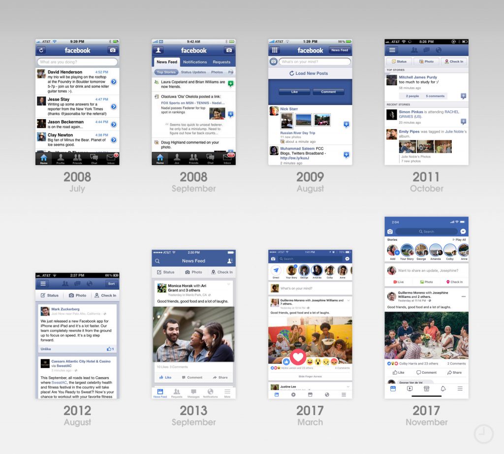
¶ If we look at interface design, we can see that what is experienced as smooth, good and pleasurable designs change depending on context and zeitgeist. A pleasurable interface 2020 does not look as it did 2000 or even 2015.

The recent design history of the Facebook-app for iPhone. From 9to5mac.

¶ The interval between upgrades and design changes varies between products and providers. The Facebook-app is eg. changed with ever shorter intervals, while other software can look the same for years. In whatever way, when we revisit an older graphical user interface it often looks or feels slightly awkward.

¶ Within interface design and UX, a trend during the last decade have been the move away from what is called skeuomorphic design towards flat design. Skeuomorphic design is based on the idea to mimick the form, shape and qualities of an object from another medium or the physical world in a new context, like on the screen of a smartphone. The flat design is instead minimalist, with clear edges and no illusion of 3D or spatial depth, except for sometimes a discreet shadowing to enhance contours. A button looks like a surface and not an illusory knob or object popping out from the screen.[1]

This illustrates Apple’s move (left to right) from skeuomorphic design to a more flat design. Image by Iain Heath, from: UX Collective.

¶ According to Wikipedia: “The term skeuomorph is compounded from skeuos (σκεῦος), meaning “container or tool”, and morphḗ (μορφή), meaning “shape”. It has been applied to material objects since 1890 and is now also used to describe computer and mobile interfaces.”

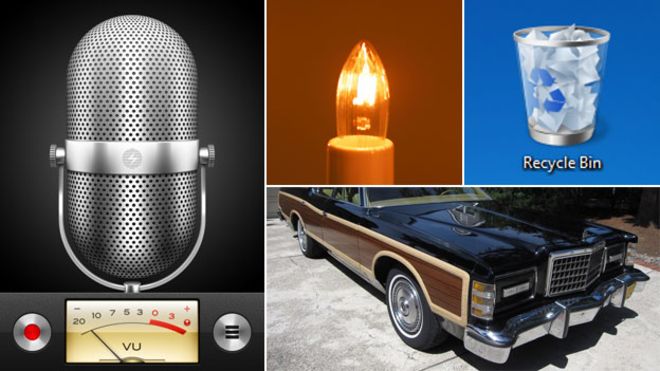
“Some examples (physical and software based) that have exploited the “Skeuomorph” notion. Clockwise from centre: a fairy light styled to look like a burning candle, the Recycle Bin in Windows 7, wood effect on a car, and an image of a standing microphone in an audio recording program”. Image and caption from Wikipedia.

¶ When it comes to graphical design in digital environments such as smartphones and computers, Apple has been a point of reference for some years. Until 2013 Apple-interfaces utilised skeuomorphic design to a high degree. Experience designer Iain Heath describe how it was the choice of CEO Steve Jobs and iOS inventor Scott Forstall to use design mimicking physical objects. This strategy made it easier for people to embrace the iPhone and to comprehend the new experience of smartphones. Skeuomorphism was used to create a smooth transition for new users, by referring to earlier things, technologies and milieus.

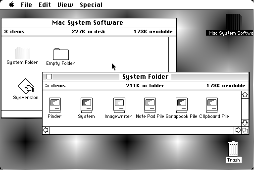
 This was not a new strategy. Earlier digital graphical environments had also to a high degree used skeuomorphs. References to earlier things have been widely used since the first graphical user interfaces (GUI) in the 1980’s, most notably through the office metaphor, including props like desktop, folders and trashcan.

Macintosh desktop 1984. Image from Wikipedia.

¶ Skeumorphs have had its proponents and critics. It has sometimes evoked strong feelings. With the introduction of iOS7 in 2013, the so called death of skeuomorphism started at Apple. The new chief designer Jonathan Ive preferred more minimal designs, avoiding unnecessary ornamentation and references to historical products. As this happened several people were cheering. This is how the move away from skeuomorphism at Apple was described in The Guardian in 2013:

Loosely speaking, skeuomorphism means “making stuff look as if it is made of something else”. In this context, it is the logic that dictates that Apple’s iBooks app resembles a cheap pine bookshelf, for example, and its Notes app resembles a yellow legal pad with lines and a margin – of the type last seen in about 1978.

Look closely, and skeuomorphism is all over Apple and other user interfaces – the little shadows cast by windows, the highlights on virtual buttons designed to make them look shiny, like real buttons. Originally this was to help us neanderthals make sense of the dazzling new technology before us, as in: “Oh, I get it. That looks like a button, so I’m meant to push it.” But Apple got skeuomorphism-drunk, plastering the screens of its futuristically minimal devices with incongruous faux wood, leather and green baize. It got ugly.

https://www.theguardian.com/technology/shortcuts/2013/jun/12/skeuomorphism-apple-ditched-ios7

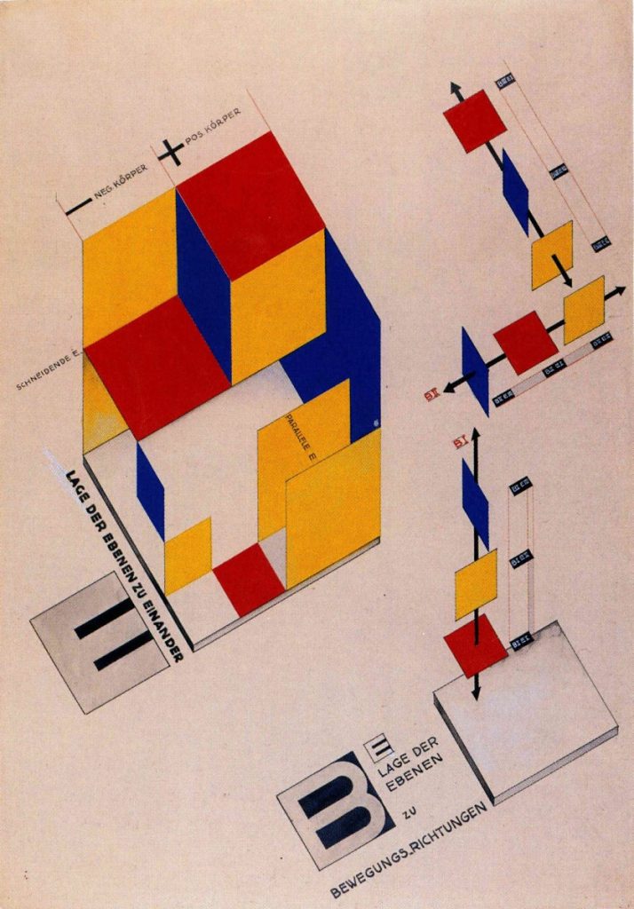
¶ The flat design could be experienced as more tasteful, and smoother. Maybe also more future-oriented, no historical references. Or? Maybe it was actually retro-future-oriented. Evoking associations to early modernism, maybe to the simplified forms, the rationality and functionality of the German art school Bauhaus during early 20th Century.

Mechanical Stage Design by Joost Schmidt, 1925. From Wikipedia. Schmidt was one of several influental typographers and graphical designer of the Bauhaus-movement.

The omission of unnecessary detail could maybe also be associated with Adolf Loos, architect, based in Vienna and active during the early 20th Century. He strongly advocated architecture without clutter and ornamentation. In his lecture from 1910, Ornament and Crime, he took thoughts about evolution as the point of departure to explain how humans went through different stages that led them away from primitive ornamentation and towards more sophisticated designs characterised by smooth and clear surfaces. Loos thought that the progress of culture could be associated with the deletion of ornament from everyday objects. According to him, it was therefore a crime to force craftsmen or builders to waste their time on ornamentation that would soon become outdated, out of fashion and obsolete. To Loos ornamentation was totally unnecessary. Just confusing, messy, in a muddle. Not smooth at all.

A 1913-poster promoting a lecture by Adolf Loos on Ornament and Crime. Wikisource.

¶ Adolf Loos was one among several apostles of budding modernist sentiments and visions about a streamlined and no-fuzz future. The clear, the functional and the uncluttered started to gain traction in everything from city planning to interior design, and some decades into the century, the domestic area was the place where smooth efficacy should be implemented. The rational, clean and uncluttered household became an ideal in The Western world. According to modernist literature- and culture-scholar Victoria Rosner:

Changes in the routines of domestic life were among the most striking social phenomena of the period between the wars. The home came into focus as a problem that should be solved: re-imagined, streamlined, electrified and generally cleaned up.

Rosner, V. (2020). Machines for Living: Modernism and Domestic Life. Oxford University Press. Page 2.

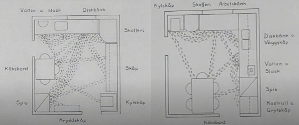
¶ In Sweden initiatives to streamline domestic work and home design accelerated from the mid of the Century. HFI (The Institute of Home Research, in Swedish. Hemmens forskningsinstitut) was founded 1944 by housewives, and the domestic science teachers’ association together with the public institution Aktiv hushållning (Active Housekeeping).[2] They were working for active rationalisation of domestic work, and the methods were based on systematic research, time studies and minute observation of domestic work. Benches should have the ergonomically most suitable height, electric appliances should replace manual work, the layout of the kitchen should provide smooth movements and work. Not one unnecessary step should be taken in the well-planned kitchen. It should also be hygienic, electrified, standardised and efficiently smooth.

Two stills from the film Ett praktiskt kök (A Practical Kitchen) by HFI, from 1953 showing the movement patterns between the different components of a kitchen. The left one shows a kitchen described as inefficient and unplanned, while the right one is a correctly planned kitchen. According to the film, the efficiently planned kitchen will save 800 steps for the measured sequence. All for the convenience and effectivity of the person (often a housewife) working in the kitchen.
The Norwegian movie Kitchen Stories (2003), directed by Bent Hamer take the 1950s Swedish project to streamline and smoothen kitchen work as the point of departure for comedy.

¶ The machine-like home promoted by organisations like HFI was built on certain assumptions and norms. The kitchen was almost like a laboratory. It was also called laboratory kitchens in Sweden, something ethnologist Lars-Eric Jönsson write about in a chapter about houses and architecture as empirical sources.[3] The kitchen was also built mainly for one person working in the kitchan at a time. The norm during mid-20th Century was also that this person was often a woman, a housewife. The kitchen should be a smooth and effective place for domestic work, well-planned and organised for the working housewife.

¶ The standardisation and planning measures of kitchens were still part of the discourse on domestic spaces in Sweden in 2020, even if the rhetoric didn’t have the same focus on scientific management and industry-inspired effectivity. Instead, it were the styles, designs and concepts provided by various commercial providers of kitchen-interiors and home-ware that characterised the discourse on domestic design. You could choose to design a kitchen inspired by a French bistro, an old farmhouse, loft living, a restaurant or a no-fuzz 1950’s HFI-kitchen. Even if the modern and the streamlined was not explicitly dominant in the selling arguments, you would not find a merchant selling a kitchen that was not described as efficient, well-planned and implicitly smooth to work and live in. In 2020 you were, like in 1953, not supposed to take one single unnecessary step while working in the kitchen or for that matter in other parts of the home. To a high degree, the smooth kitchen had also become the smart kitchen. The idea about smartness in the intersction between home and technology is something that we’ll come back to in other Files.

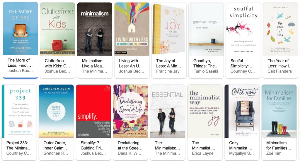
 What about kitchen smoothness the design move that was taken by Apple and other companies for their graphical interface design? The move away from ornamentation and decoration to flat and minimal designs. Did that occur also in physical design for domestic spaces? If we think about the move from skeuomorphism to a more flat design as a kind of decluttering, then the answer is yes. In 2020, in a world of ubiquitous consumption, decluttering and minimalism were promoted as part of self-help, as a way to fulfill your life, as a way towards sustainability and the real good life. Techniques, guidance, tips and tricks were offered by persons/brands like Marie Condo, Joshua Becker or The Minimalists (Joshua Fields Millburn and Ryan Nicodemus). 

A Google-search for minimalism in May 2020 could offer an abundance of decluttering and anti-materialist life-smoothening literature (a copy’n’paste-collage of book titles offered via Google in May 2020). Taking all the minimalism-offers would certainly clutter your bookshelf (and life).

¶ There were differences betwen the ways that minimalism, de-cluttering and smoothness in life were promoted and advocated. Some were adovating very practical design- and cleaning-tips, others were more oriented towards spiritual transformation or towards suggesting people to “simply” live a more meaningful life.

Matt D’Avella present his take on early 21th Century-minimalism and simple living while also interviewing advocates of the movement like Leo Babauta and The Minimalists.

¶ Wishes for minimalism and a simpler life has been around probably as long as people have experienced abundance and excess. In The Longing for Less, Kyle Chayka discuss today’s minimalism-trends and relate them to a number of earlier examples, like Henry David Thoreau’s escape from modern life into a cabin in the woods in Walden in the 1840’s, John Cage’s art and music as well as 1970’s minimalism-proponent Duane Elgin, who at the time wrote Toward a Way of Life That is Outwardly Simple, Inwardly Rich. From a US-perspective he also reflect on how ideas about individual accomplishments maybe has made US-citizens more vulnerable to minimalism-gospels.

The United States is particularly vulnerable to the charms of minimalism. Something about our belief in the power of self-definition and starting over suggests to us that if we only sweep our floors we will magically become new people, unburdened by the past. Maybe it started with the iconoclastic act of throwing tea off the boat in Boston Harbor, or it’s the misperception that the country was simply blank space before the Pilgrims came from England and the pioneers headed west to occupy Native American lands. We like to think that we can do without, rough it to prove that we’re not so soft or bound to the past, In fact, we’ve gone through a few nationwide cleaning fugues before Kondo.

Chayka, Kyle (2020). The Longing for Less: Living with Minimalism. New York: Bloomsbury Publishing. Page: 1-IV.

¶ There are national, social and cultural differences in how ideas like minimalism spread and become popular. The conditions in Sweden and US is different, while some things might be similar. Minimalism has a number of variations, meanings and shapes. Chayka reflect on why the concept and the ideas had taken hold. He noted that:

Minimalism, I came to think, isn’t necessary a voluntary personal choice but an inevitable societal and cultural shift responding to the experience of living through the 2000s. Up through the twentieth century, material accumulation and stability made sense as forms of security. If you owned your home and land, no one could take it away from you. (…) Crises following crises; flexibility and mobility now feel safer than being static; another reason that owning less looks more and more attractive.

Chayka, Kyle (2020). The Longing for Less: Living with Minimalism. New York: Bloomsbury Publishing. Page: 1-II.

¶ This analysis could hold true when it was written. Then came the Corona-crisis, with quarantine, extensive restrictions in mobility. People cocooning in their homes. If they had one. Now real estate and property became extremely important. Old school capital and possessions was what counted. A large living space, filled with stuff and things that could be used when you had to stay put, stay in your own place. These things counted. Ideas about property, value, “the good life”, convenience and smoothness shifts and changes with the times. Sometimes the shifts come abruptly.

 Ethnologist Orvar Löfgren has been studying how excess and order is conceived and practised in domestic settings for decades. He stress that it has always been a tension, what he calls a moral economy, emerging in relation to ideas about everyday overflow and how people handle and think about things. How much is enough? When and for whom? The present has always seemed to be more messy than friction-free futures, or for that matter more messy than simplified and sometimes idealised pasts. With the coming of the 21th Century, new digital technologies and the societal development was supposed to (finally) make domestic life smarter and smoother. But like so often, reality resisted.

Domestic life in the twenty-first century was supposed to be cyber-light and friction-free, thanks to all the new technologies that would simplify people’s lives. Most Western homes are, however, still veritable jungles of clumsy objects and gadgets, utensils and tools crammed into every available space. Cupboards and wardrobes may be bursting, cellars and attics cluttered. Little gadgets let out green or angry red blips in the kitchen, electric cords create jungles under the tables. People devote a large amount of energy and resources to handling this abundance; things are shuffled back and forth, rearranged, recycled. Every day, new objects enter and old ones are lost, forgotten or wasted, leaving by the back door.

Löfgren, Orvar (2015). The Black Box of Everyday Life. Entanglements of Stuff, Affects, and ActivitiesCultural Analysis13, 77–98. Page 83.

¶ What is enough, what is preferable and smooth? Smoothness, as a concept, like simplicity, is not that smoothly defined. It is a word that we can use to better understand certain phenomena. In a short, witty and thought-provoking text, anthropologist Richard Wilk plays with the idea of using smoothing as the point of departure to design new concepts to understand culture. He present and reflect around cultural analytic concepts like realignment as a kind of cultural chiropractic, retrodiction as a kind of historical smoothing, folding up as a way of putting narratives and stories into smaller packages, or wrapping a process, concealing it inside another, and so on. Words can be used as vehicles for the imagination. Etymologically the very word metaphor can be traced to ancient Greek, and the meaning to transfer or carry across.

¶ When Wilk playfully discusses smoothing and ways to do cultural analysis with words, he starts the text by stating how all these attempts to describe cultural phenomena and processes, this smoothening, is unconditionally restricted by the fact that human practice is seldom easily defined, framed, streamlined or put in a neat box:

There is nothing regular, planned, symmetrical or consistent about culture; it has no geometry. Cultural processes of change are equally messy and unpredictable. Even in retrospect we rarely find trends over time which fit straight lines or simple logarithmic curves, and simple repetitive cycles are equally rare. From a contemporary standpoint, directions and trends are even more chaotic and difficult to discern. Every rule seems to have exceptions, no boundary is completely fixed, and culture seems to constantly burst out of whatever category we use to contain and describe it.

Wilk, Richard (2005). SmoothingEthnologia Europaea35(1–2), 23–27. Page 23.

 Cultural processes are hard to easily capture and convey. But we have to use the tools we have to better understand the world. The word smooth can be one such tool. It can, like several other words, also be an invocation or a call to action. The expression “Get smooth!” generate associations and imaginaries, it might lead to action, and it is coupled to ideas about values, moral, aesthetics and what is preferable. The smooth can be efficient, clean and organised, but also featureless and dull. There is a world of associations and practices opening up when thinking about what is smooth and what is not smooth in relation to technologies and how humans experience and imagine everyday life in different contexts.

¶ Let’s now move back to Klarna’s campaign with Smoooth Dogg. It plays with the polarities and variations of smooth, with the different guises of smoothness. Smoooth Dogg is not minimalist. It is extravaganza and frivolous spenditure. But this spenditure could be offered through a smooth interface, through smooth operations beyond the interface, at the backend.

Example of a checkout or order placement dialogue window as part of Klarna’s instructions for developers. From Klarna.Developers.

¶ What did it take to get that Klarna-smoothness? Or that smoothness suggested by other stakeholders using digital technologies to offer services and products. In order to receive smooth experiences you have to take the offer. An offer that in 2020 was often presented in a GUI-window, where you simply had to click. To approve, confirm, agree, acknowledge. These clickwrap-boxes where you by a simple click could move on in a process were extremely common during the early 21th Century. They were used by major players like Google and Facebook, as well as by smaller ventures and organisations. But they all used the same logic… Subscribe, upgrade to premium, download, follow, be a customer or user, purchase. If you want smooth, then submit to services and terms. Submission by a simple action. Smoothly, with just one click.


[1] Like all trends and cultural phenomena, they are never clearcut, unison and totally homogenous. Skeuomorphism was still important in design in 2020. Trashcan, desktop etc. were still design elements in digital interface environments. Several software environments also used other detailed symbols from the world outside computers. But the trend away from skeumorphism was dominant among many “big players” like Apple. In 2019 the neologism neumorphism (or neomorphism) also appeared in UX-circles. Neumorphism was based on the idea of a quite minimal design that took some inspiration from skeuomorphism. Instead of totally flat design, buttons and other design elements were designed so that they looked like slightly elevated from the background, like embossed structures, giving the impression of depth and 3d without using all the details that dominated skeuomorphism from 10 years ago.

With Mac OS11, also called big Sur, Apple was also bringing back some skeuomorphic elements in 2020. Design trends and aesthetics do not follow any rulebound evolutionary path, as is sometimes imagined and proposed. It is an ongoing entanglement of reiterations, opposing trends, slow as well as abrupt shifts, and a plethora of parallel preferences and designs emerging, transmuting and disappearing in different social and cultural contexts.

Skeuomorphs also occcur beyond design practices. Sociologist Stefan Larsson has researched how metaphors and skeuomorphs are utilised and become crucial for the way law is practiced and conceptualised. In a study of the copyright case against the file sharing activities of The Pirate Bay, he show how the use of skeuomorphs became crucial for the outcome, see: Larsson, Stefan (2013). Metaphors, law and digital phenomena: the Swedish pirate bay court case. International Journal of Law and Information Technology21(4), 354–379.

[2] Brunnström, Lasse (2018). Swedish Design: A History. London: Bloomsbury Publishing. Page 88.

[3] Jönsson, Lars-Eric (2017). Byggnaderna, sakerna, arkivakterna. In: Jönsson, Lars-Eric, & Nilsson, Fredrik (2017). Kulturhistoria: En etnologisk metodbok. Lund: Department of Arts and Cultural Sciences, Lund University. (The chapter is written in Swedish)


Version History

V 1.1 August 5 2020. Part added about the norms of domestic work in the mid 20th Century kitchen. Also added reference to Lars-Eric Jönsson (2017).

V 1.2 August 19 2020. Added a reference to Stefan Larsson’s work on metaphors and skeuomorphs in relation to practices of law (under note 1.).

Categories
The Mundania Files

Walled Gardens

A collage of a biohazard sign and a hydrophonic product (by Plantui).

¶ When the circles are becoming narrower, when societal mobility is minimised and the small world comes in focus, ideas about self-sufficiency and the homegrown might shoot up. An own garden, with plants, herbs and fruits. Closed and walled. Combine that with ideas about smart things, and stakeholders like Finnish company Plantui might become successful. They develop and deal with Hydroponic growth. Hydroponics is a way to grow plants in a closed controlled system, without soil and using a nutritious solvent.

These three steps illustrate the Plantui-process how to start growing Basil.

¶  Hydroponics has a long history, and is related to various ways of experimental growing techniques. There are several varieties of hydroponic products, coming from different developers and companies. Everything from highly standardised systems that offer different products, kits and accessories, to more open-ended and do-it-yourself-style systems.

IKEA is one of the stakeholders selling Hydroponic systems.

¶ The recent interest in hydroponics coincides with a growing attention for smart home products. Bosch’s Smart Indoor Gardening system eg. comes with the SmartGrow app, a way to gain smartphone interaction with plants and the gardening process.

¶ Software-controlled and networked cultivation systems are extensions of the development of domestic settings as experiment ground for engineers and product developers. The engineered domestic gardening systems might be seen as a continuation of the standardised home as machine, so often associated with architect Le Corbusier:

A house is a machine for living in. Baths, sun, hot water, cold water, warmth at will, conservation of food, hygiene, beauty in the sense of good proportion. An armchair is a machine for sitting in, and so on.

Le Corbusier (1986). Towards a New Architecture, (trans. Frederick Etchells). New York: Holt, Rinehart and Winston. page: 89.

¶ Or in a Swedish context, the standardised and machinic home, is often associated with the governmentally led Home Research Institute (Hemmens Forskningsinstitut, HFI) that from the 1940’s and onwards worked to standardise and improve the domestic working environments for housewives.

FarmBot is an example of how industy-inspired robotics is promoted as a domestic product.

There can be a tense relation between engineering and gardening. Gardens as well as the indoor cultivation of plants have had a contradictory relationship to engineering. How much can or should you organise, standardise and control something that lives, grows and is organic? To engage with a garden, means to follow certain rhythms, to deal with organisation and bordering, but also to be submitted to processes that you can’t fully control. As ethnologists Katarina Saltzman and Carina Sjöholm write in their research about domestic gardens: ”To live with a garden is to influence and be influenced by an environment; to form it and be formed by it.”[1] It is a constant negotiation about what to control and what to leave out of control. What should be fended off and prevented from coming into the garden, and what should be planted and introduced in the secluded ecosystem? And how should you let the garden influence you?

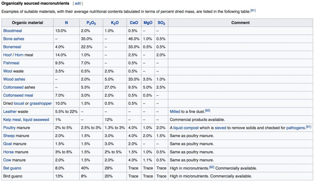
This table of organically sourced macronutrients show the scientific discourse around Hydroponics. From Wikipedia.

 During the last ten years, new technologies like hydroponics in combination with wirelessly controlled smart home appliances have opened up new associations between fuzzy concepts like nature and the artificial. In urban contexts, like eg. Dubai, the controlled indoor gardening based on hydroponics has been promoted as a way to reduce stress and to connect with nature.[2] When Jean-Charles Hameau, founder of My Green Chapter, an online garden center in Dubai, is asked by The National for his predictions about future tech and smart plants to come, he predicts a  system that more or less creates its own atmosphere:

I predict that they will all be computer-operated, from planting the seed to harvesting crops. However, in my opinion, plants do need a certain degree of human interaction. In our smart garden, the seeds come in capsules with moss in it, but in the future, I can see seeds being in the form of an actual capsule or pill, which would be dropped in the water to sprout and create its own atmosphere.

https://www.thenational.ae/lifestyle/home/the-science-behind-smart-plants-and-why-they-suit-uae-homes-1.722823

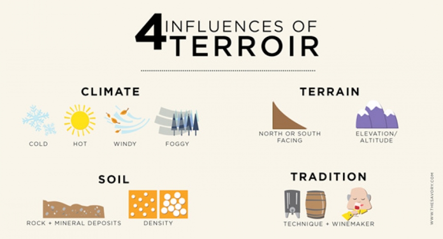
¶ Hydroponics and related methods create closed controlled systems, somewhat disconnected from the spatial surroundings. Since no soil is used, concepts associated with gardening and cultivation, like terroir become irrelevant. Terroir, or the taste of place, is often used when describing how certain geographic locations offer special circumstances (soil quality, climate etc.) that give eg. a certain wine grape or cheese a special taste and quality.

From: https://winegeography.com/wine-making/

¶ Anthropologist Heather Paxson has written about terroir in relation to cheese production in the United States, and discuss how relations between products and place are framed as well as how ideas about autenticity and quality relates to standardised systems of certification and economic interests.[3]

Hydroponics and similar cultivation technologies challenge the ideas about terroir, in favour of standardisation and control. So, what would be the ultimate limit for terroir? There is not any specific terroir when growing plants indoor in pots. There is definitely no terroir in extraterrestrial space. This is instead the realm for artificial and scientifically controlled varieties of growth or gardening. The closed controlled environments of hydroponics have been utilized for space travel and for the very special domestic conditions in places like space stations and other extraterrestrial habitats.

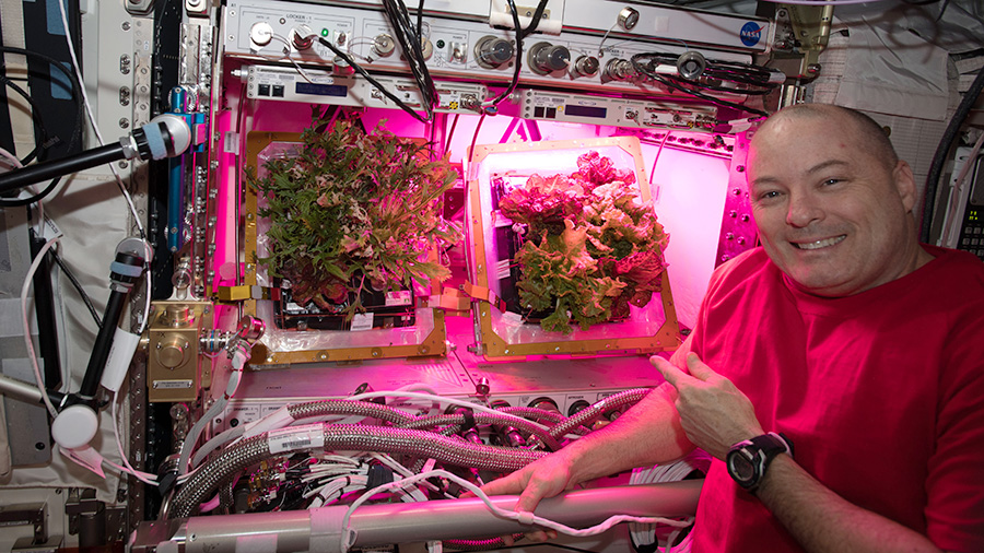
NASA astronaut Scott Tingle showing the Veggie facility. Image courtesy of NASA

¶ In an article, published by NASA in 2018, PhD and plant physiologist Ray Wheeler talk about the plant chamber Veggie, developed for the International Space Station and possible future missions to Mars:

As NASA prepares the Space Launch System rocket and Orion spacecraft for Exploration Mission-1, it’s also turning its attention to exploring the possibilities of food crops grown in controlled environments for long-duration missions to deep-space destinations such as Mars. 

Wheeler and his colleagues, including plant scientists, have been studying ways to grow safe, fresh food crops efficiently off the Earth. Most recently, astronauts on the International Space Station harvested and ate a variety of red romaine lettuce that they activated and grew in a plant growth system called Veggie.

Wheeler, who has worked at Kennedy since 1988, was among the plant scientists and collaborators who helped get the Veggie unit tested and certified for use on the space station. The plant chamber, developed by Orbitec through a NASA Small Business Innovative Research Program, passed safety reviews and met low power usage and low mass requirements for use on the space station.

https://www.nasa.gov/feature/nasa-plant-researchers-explore-question-of-deep-space-food-crops

¶ Plants cultivated beyond earth is a suggestive subject. Growing and preserving plants in space was also the theme of cult science fiction movie Silent Running, that premiered 1972. The plot of the movie was built around the idea of plants transported from earth in a space ship.

As this science fiction classic opens, botanist Freeman Lowell (Bruce Dern) has spent eight years aboard the space freighter ‘Valley Forge’ preserving the only botanical specimens left from Earth under huge geodesic domes. When he receives orders to destroy the project and return home, Lowell rebels and hijacks the freighter, while plunging the craft into the gaseous Rings of Saturn. From that moment on, he has only the trees, the gardens and two ‘Drone’ robots, Huey and Dewey, to keep him company on his greatest adventure of all.

https://www.youtube.com/watch?v=gBWO6oJStZk

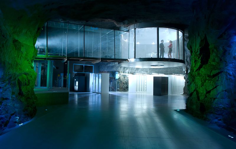
 Silent Running and the theme of plants in outer space was the explicit inspiration for the design of one of the more spectacular data centers in Sweden, Pionen in Stockholm. The data center, located in a refurbished civil defence bunker under the city is run by company Bahnhof, one of Sweden’s largest internet service providers.

The data center Pionen, located under Södermalm in Stockholm. Image by Bahnhof.

¶ In an interview with Wired, CEO Jon Karlung describe how he wanted to capture the computers-meets-plants vibe of Silent Running, and how the rationale behind the data center-design emerged :

The first thing Jon Karlung remembers about the sealed room inside the nuclear bunker he renovated six years ago is its murky odor. It smelled like a crypt. Then, looking around, Karlung’s crypt felt more like a flashback machine. “It looked like something from childhood,” he says. “With these ’70s green and orange colors. It was like a time capsule that had not been renovated or changed since the 1970s.” That bunker, called Pionen White Mountains is located just south of Stockholm. Nearly 20 years after Sweden’s Civil Defense decommissioned it, Karlung converted it into a data center. A few years ago, it was briefly the most famous data center in the planet — home to WikiLeaks. 

And what a home it was; Karlung’s internet service provider, Bahnhof, took the nuclear bunker idea and went all-in. It now looks like a cross between a James Bond lair and the eco-pod-filled spaceships of the 1972 cult sci-fi film Silent Running. Karlung, who worked briefly as a film archivist before getting into the data-center business, says that he immediately thought of putting plants in the underground caves to capture the computers-meet-plants vibe of Silent Running. “It had this mood and it had this atmosphere that I liked. It captures this atmosphere of growing something from outer space.”

https://www.wired.com/2012/11/bahnhof/

¶ Karlung mention how the subterranean facilities of Pionen had the mood and the “atmosphere of growing something from outer space”. Controlled smart gardening and hydroponics might also have an outer space vibe or atmosphere. It might as well be used to support extraterrestrial living. In that sense, these methods of enclosed gardening has an outward-orientation. The mobile and contained garden is part of a life supporting system that makes it possible to move outwards, to even travel away from Earth.

¶ Smart gardening and hydroponics are however also closed systems or gardens. Closed gardens have an inward-orientation, implicated by the very word “closed”. The enclosed and walled garden that keep (possibly evil) things out and that protect what is inside. The walled garden can also be a symbol for introspective spirituality. The long European and Middle Eastern history of walled gardens even have a immediate connection to the etymology of the word paradise.

¶ The word paradise can, according to Wikipedia, be traced to the: “Latin paradisus, from Greek parádeisos (παράδεισος), from an Old Iranian form, from Proto-Iranian*parādaiĵah- “walled enclosure”, whence Old Persian 𐎱𐎼𐎭𐎹𐎭𐎠𐎶 p-r-d-y-d-a-m /paridaidam/, Avestan 𐬞𐬀𐬌𐬭𐬌⸱𐬛𐬀𐬉𐬰𐬀 pairi-daêza-.”

 The Garden of Eden as paradise can be derived from this etymology. Paradise as “walled garden”, as an enclosure, under control. During medieval times the walled garden was a common theme in Christian art, often referred to as Hortus Conclusus:

Hortus Conclusus is the Latin for an enclosed garden. The depiction of such a garden in Christian art from the Middle Ages onwards is often intended to suggest purity. The garden is frequently shown walled, so implying impenetrability. The image refers to the virginity of Mary, Christ’s mother. 

The idea of the Hortus Conclusus is also associated with the Garden of Eden of the Old Testament.

https://www.nationalgallery.org.uk/paintings/glossary/hortus-conclusus
The Madonna on a Crescent Moon in Hortus Conclusus by an anonymous painter. From Wikipedia. See the project description for: The Enclosed Garden: Pleasure, Contemplation and Cure in the Hortus Conclusus 1100-1450 for a discussion about the walled garden as a gendered space.

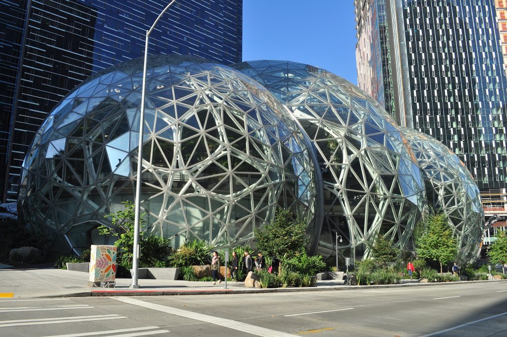
¶ The paradise-like walled garden has been a common theme with different guises throughout the history of gardening. Another enclosed garden is the greenhouse, which also has a long history. In the 18th Century the first glass-encased greenhouses were developed, leading to a new era of transparent enclosed gardens, and the beginning of industrialised artificial growing. Recently several tech-companies have chosen to design work spaces as contemporary greenhouses. One notable example is company Amazon’s Spheres in Seattle.

The Spheres are a place where employees can think and work differently surrounded by plants.

The Spheres are a result of innovative thinking about the character of a workplace and an extended conversation about what is typically missing from urban offices– a direct link to nature. The Spheres are home to more than 40,000 plants from the cloud forest regions of over 30 countries.

https://www.seattlespheres.com
Amazon Spheres from the Sixth Street side, Seattle, Washington, U.S.. Photo: Joe Mabel (From Wikipedia).

¶ Concepts like The Spheres somewhat remixes the idea of Walled Gardens and greenhouses as places for inward journeys and contemplation into spaces for ideation and creative work. Places where ideas and innovative work could flourish in the enclosed space of the greenhouse, in the atmosphere evoked by the co-presence of collected and juxtaposed growing organic specimens from faraway habitats.

¶ Within the digital economy around 2020, Amazon was one of five big US-based and extraordinarily powerful stakeholders. The other four, Google, Apple, Facebook and Microsoft were together with Amazon controlling the logic around digital communication and infrastructures. One thing the companies had in common were their ambition to build and maintain their own robust and profitable systems where their products and services could thrive. Sometimes the systems were referred to as ecosystems or platforms, but sometimes also as walled gardens. Even if the latter metaphor were used more seldom in 2020.

¶ The economical and strategical paradise for a company among “The Big Five” would probably be to be the owners and controllers of a walled garden. A space where they are in (total) control, where customers are kept in an enclosed space, among the products offered in this monetary Hortus Conclusus. But it is often hard to maintain walled gardens. And the walled garden is seldom the dream scenario for customers. You are submitted to the decisions, designs, whims and visions of the ones controlling the garden.

¶ There have been several examples of techno-economical walled gardens. Some successful, some less so. Many game consoles, like Sony Playstation, Microsoft XBox or Nintendo and SEGA have used walled garden-like concepts. Among the companies in The Big Five, Apple is famous for controlling compatibility in a way that is similar to a walled garden logic, where hardware, software and services are designed to operate and to be used in closed and controlled systems.

¶ There seems to be a constant oscillation between open and closed systems in digital economies. Open platforms or closed gardens? Or to twist the metaphors: Monolithic platforms or dynamic ecosystems? The question is what the next movement will be. In which direction does the pendulum swing? Will systems be more closed or more open? In 2020 The Big Five did run their own platforms, enmeshing different interfaces, micro services, collaborators and protocols. If taken altogether, the question is if the macro-ecosystem based on the entangled Big Five could be seen as a gigantic Walled Garden?

Part of the accessories assortment provided by Plantui.

¶ Let’s move back to the beginning of this file, to the popularity of hydroponics and “smart gardening”. When it comes to the providers of hydroponic systems, there seems to be a preference for not only closed biological systems, but also for economical walled garden approaches. Systems by Bosch, IKEA or for that matter Plantui provide a number of compatible products in a controlled assortment. These doesn’t seem to be systems where third parties are let in, more than in strict collaborations (like Plantui’s collab with Moomin). In 2020, domestic hydroponic systems and smart indoor gardens were closed systems, enclosed technological gardens and product assortments. Biology, technology and economy in a possibly symbiotic relationship.


[1] Sjöholm, Carina, & Saltzman, Katarina (2016). Managing nature in the home garden. In Lesley Head, Katarina Saltzman, Gunhild Setten, & Marie Stenseke (Eds.), Nature, Time and Environmental Management: Scandinavian and Australian perspectives on peoples and landscapes. London: Routledge. (112-129). page: 126.

[2] A counterpoint to gardening practices as stress-reducing and nice ways to get in contact with Nature is offered by Abrahamsson and Bertoni in Compost Politics: Experimenting with Togetherness in Vermicomposting. They bring up the more messy aspect of domestic gardening and ask:

What practices emerge at the mundane interstices of the ‘big picture’ of a functional ecology? Wasting, eating, rotting, consuming, transforming and becoming-with are brought together in a variety of ways in practices of composting-with earthworms. Reporting on our own and others’ attempts to ‘live-together’ with earthworms, this paper tracks the non- relations and asymmetries of the transformations of more-than-human materialities inside (and outside) domestic composting bins.

http://environmentalhumanities.org/arch/vol4/4.7.pdf (Page 125)

[3] Paxson, Heather (2010). Locating Value in Artisan Cheese: Reverse Engineering Terroir for New-World Landscapes. American Anthropologist112(3), 444–457. https://doi.org/10.1111/j.1548-1433.2010.01251.x


Categories
The Mundania Files

Isolation Oddities

 The Virus and the 2020-pandemic gave the word isolation new meanings. Social distancing and staying at home became crucial. How could you shield yourself from threats in the environment, from contagion and disturbing external elements?

¶ One of the central technologies for isolation was the respiratory protection mask. The abbreviation FFP (Filtering Facepiece Particles) hadn’t been part of common knowledge in Sweden before, if you hadn’t been working in environments where you needed dust protection or for that matter within the healthcare system. In April 2020 you could have a discussion if FFP2 was enough protection against the virus. No, FFP3 was needed. Aerosol filtration and properly techniques to use this technology. Is the mask there to protect yourself or to protect others from you? Masks and their different varieties, how to get them, who produced them and how to use them. Face masks as possible fashion items and accessories, white, black, blue or patterned. It was suddenly part of people’s attention, part of debates and popular culture.

In April 2020 Canadian rapper Drake made a Corona-influenced video, based on him being quarantined in his Toronto mansion, while moving to the dance Toosie Slide, first popularised through TikTok. In the video Drake is sporting protective gear like face mask and gloves. The outside world first shown as empty streets, then mostly present through featured brands like Alyx or Nike, or through references evoked by props, furniture and conspicuous decorations in Drake’s house.
Einstürzende Neubauten also made a Corona-isolation-inspired video for their April 2020 single Ten Grand Goldie, in which vocalist Blixa Bargeld wore a protective face mask. The video features footages from “neubauten.org supporters sheltering in place”.

¶ Face masks was one dimension of isolation, another was the idea about domesticity and The Home. It became obvious that the way people lived differed. Mansions or tiny apartments, or even the lack of a proper home. The number of persons in a household. These things became crucial for how quarantine and social distancing would work. How did people create a place that felt comfortable, homely and in which isolation was feasible. In her research about homes and domestic life, anthropologist Sarah Pink has stressed how home is more than a space to live in. Home is a feeling. Home is made through peoples practices:

Home is created through our everyday actions and relationships, through the meanings we invest in a place, through the sentiments that are tied to the home, and through the digital technologies that now mediate how we make homes.

Framing home as a feeling, rather than a house, helps us to understand why new houses rarely ‘feel like home’ until we’ve settled in, and it complicates, without eliminating, the existence of the home in a house characterised by inequality, violence, isolation, depression or worse. Home can be fleeting, shifting, and momentary—carved out and saved from the chaos that might surround it. The dissonance between house and home also provides us with some key messages for understanding the implications of #stayathome.

Pink, Sarah (2020) #stayathome: being in an uncertain place. In: Future Matters, ETLab, Monash University, Melbourne.

¶ And for the ones who should work at home: How could you turn the home into a workspace? How could working-from-home be effectively organised? For some workers, Zoom, Teams or Skype-meetings became part of everyday life. Virtual backgrounds on screens, muting and unmuting of microphones. New meeting etiquettes and rhythms. Some created small bubbles and micro-spaces in their homes to gain concentration. Closets, attics and corridors got new roles as workspaces.

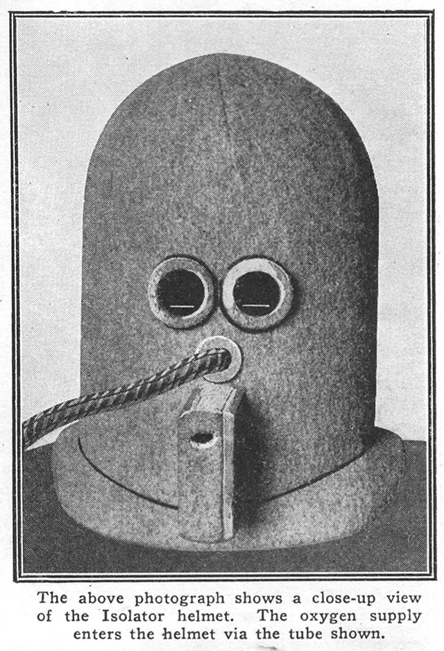
¶ These two dimensions of isolation, the mask and the domestic workspace for concentration has got its surreal predecessor in The Isolator. This technology, this helmet was invented in 1925 by Hugo Gernsback. The idea behind The Isolator was to create a small space, an interiority, in which the user could really concentrate. A sensory enclosure. All outside noise was kept abay by the helmet. The small slits, through which the user could look, were just big enough to see merely a line of text. This should afford extreme focus and concentration. The oxygen was supplied through a hose, so the user got merely what he or she needed. Minimal information and visual feedback from the outside world and the life supporting oxygen.[1]

¶ We are at a time when isolation has got a new meaning. Uncertain times, that will probably provoke a plethora of new ideas. The question is what kind of odd innovations the Corona crisis will spark? What will be The Isolator of 2020?


[1] For an extensive collection of writings by Gernsback, in which the inventor and writer present The Isolator among other inventions and thoughts, see: The Perversity of Things – Hugo Gernsback on Media, Tinkering, and Scientification, an edited volume by Grant Wuthoff.


Version History

v. 1.1. May 25 2020. Two Youtube-videos (Drake and Einstürzende Neubauten) with caption added. Minor language corrections.

v. 1.2 May 29 2020. Added a section about home as a feeling and a place made through practices, based on a reference to Sarah Pink (2020).

Categories
The Mundania Files

Waiting for Events

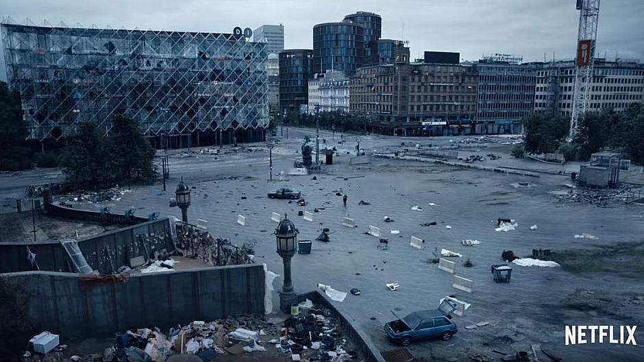
¶ When catastrophe happen in fiction, it is often dramatic. It comes as a sudden event. The Netflix-series The Rain (2018) is about a virus, spread through rainfall. It all starts in Copenhagen. The series is full of alluring ruin footage, simultaneously beautiful and horrifying. A postapocalyptic Greater Copenhagen Area. The infrastructure, so familiar for the ones living in the region, demolished, abandoned, ruined. 

¶ The Rain is like a dark mirrorworld of the Corona-world. The oneliner in the trailer: ”You never know when your world is about to change”, bunkers, isolation, a killing virus, civilisation wiped out. The usual formula of postapocalyptic thrillers. Everything twisted into dramatic terror and bombastic disaster.

¶ The occurrences around COVID-19 were dramatic, to some extent. But for many people, not immediately struck by the virus or its chain reactions, life was characterised by slowness. Everyday life had changed, but most of the change seemed to take place somewhere else. People stayed at home, in ”the small world”. Waiting for events. Looking for signs of a coming change. Surfing curves and evaluating prophesies. Listening to the pleas from authorities, pleas for collective discipline: Follow rules and recommendations. People were trying to comprehend Lock-down society or the metrics and practices of social distancing. Associations to war-time were evoked. But the front was ephemeral, somewhat manifested in the Intensive Care Units in hospitals, the healthcare workers being the heroes of confined worlds. The catastrophic was lurking like an undertow running below the mundane. Drama was hinted at in the news. A liminal state, waiting, a state of buffering. 

¶ Buffering occur while a stream of data loaded in advance of a rendered online-video is choked. As a watcher you are forced into a state of waiting, while the flow of events in the video is paused.

¶ Buffering is the digital technological equivalent of the philosphical concept becoming, a state through which humans are not merely being, but all the time becoming. Humans are becoming through living, experiencing, perceiving and thinking together with the things of the world, immersed in a continous flow of impermanence and flux.

¶ Anthropologist Tim Ingold, drawing on philosphers like Maurice Merleau-Ponty, Gilles Deleuze and Félix Guattari, have contemplated on the way that humans live life as a kind of go-along or entanglement together with things, materialities and various entities. “To know things you have to grow into them, and let them grow in you, so that they become a part of who you are”[1] This is a transformative process, a process of self-discovery/learning about things and the world. You learn and become who you are through cohabitation with things and entities.

¶ Sociologist Deborah Lupton, when writing about the ways people live with the data that is generated by them, expounds on Ingold’s approach by stressing that he:

…contends that material artefacts are never fixed or completed. Because they are open to new meanings and uses, they are always in a process of becoming something else. As they move into new or different contexts, artefacts change in meaning, even if not always in shape.[2]

¶ When living with networked digital technologies, the process of becoming is conjoined with the properties and manifestations of the technology. One such property is buffering. A feedback loop might occur between human becoming and technological buffering. A movement along with technology, through which human lingering is conjoined with technological buffering.

¶ Buffering is a major theme in author Tom McCarthy’s novel Satin Island.[3] The novel is an intriguing account of the life of a corporate anthropologist during the 2010’s. The protagonist U., with a background in university-based anthropology, has left academic life to work in a corporation. He’s doing applied or corporate anthropology. The book delivers some good and quite witty analyses of anthropological practice in a corporate world:

What does an anthropologist working for business actually do? We purvey cultural insight. What does that mean? It means that we unpick the fibre of a culture (ours), its weft and warp – the situations it throws up, the beliefs that underpin and nourish it – and let a client in on how they can best get traction on this fibre so that they can introduce into the weave their own fine, silken thread, strategically embroider or detail it with a mini-narrative (a convoluted way of saying: sell their product).

Satin Island. page: 20-21.

¶ U. works on an extensive and open-ended-project called “The Great Report”. Inspired by early anthropologists, especially Claude Lévi-Strauss and dreams about the combinatory and general intellectual work of polymaths such as 17th and 18th Century Gottfried Wilhelm Leibniz, U. tries to find a secret logic behind the overwhelming flows of data, information and goods in the world. He formulates something called Present Tense Anthropology.[4]

¶ Through Present Tense anhropology U. collects a wide array of stories and vignettes about everything from oil spills to dead parachuters. But all the time, the endeavour is characterized by a kind of preparation for something, a kind of lurking anticipative atmosphere, a state of suspension, buffering.[5] The growing diverse collection of material for The Great report is there as potential seeds, from which narratives could sprout. But not quite yet.

¶ This mindset, through which all actions and experiences are lived while preparing for how the experiences can be presented for others in the future, characterize the novel. A mindset or a kind of social media-ethos, through which experiences are always lived in a reflexive state aimed at potential future Instagram-posts or Tweets. Provisional renditions. Mundane suspension. Material collected and composed to eventually be used in the future. An uncertain future.

Tom Mccarthy made this video for BBC Newsnight, as an extension of the novel Satin Island. It’s about concepts from the novel, about buffering and the role of corporate anthropology in a data-saturated world.

¶ Buffering also characterized Corona-2020. Now it was at a large scale, societal, collective level. The overwhelming flows, the wide-ranging mobility of airports and bustling tourist sites from the Satin Island-novel had been brought to an almost standstill. Instead of flow and mobility: Buffering.

 The real action taking place in caring units and among people fighting the virus or handling the collateral damage. Or in the improvisatory work of organisations that hastily had to reorganise. Preparing for the worst, while hoping for the best. In the obfuscated work taking place beneath the surface, beyond grasp in datacenters, in the electronic circuitry, and among often neglected sectors of service- and maintenance-work. For many people, the crises meant enormous stress and arduous work. Except that: buffering.

 Waiting or buffering can be especially charged when living in a society characterised by “change imaginaries”, by rapid change, speeed and expectations of instant delivery. In the book The Secret World of Doing Nothing, ethnologists Billy Ehn and Orvar Löfgren make an extensive analysis of the role of waiting, impatience and boredom in Western culture. They argue that:

It is difficult to know if we wait more or less patiently than people did in earlier times, but in an era where “time is money” and where we have become accustomed to immediate gratification any wait can feel as if one had been waiting “for an eternity.” The modern landscape of impatience takes on emotional charges–irritation, restlessness, anxiety, boredom, and longing–as well as evokes ideological debates.

Ehn, Billy & Löfgren, Orvar (2010). The Secret World of Doing Nothing. Berkeley: University of California Press. page 209.

¶ Waiting is something humans always have done, but the way it is experienced, imagined, discussed and handled varies depending on time, space and context. During the Corona-crises waiting got its special characteristics. In debates and discussions the frustrated question about “how long will this last” was recurrently asked. What are we waiting for? What is the prognosis, how does the curve look, what does the experts say?

¶ The buffering-state is a construct, whose techno-organisational underpinnings have to work to keep the circle spinning. Or, buffering will turn into a full stop. But when it works, when the societal buffering-circle spin, we are in a digitally engendered state of preparation and premediation. Waiting for some eventful future.


[1] Ingold, Tim (2013) Making. Anthropology, Archaeology, Art and Architecture. London: Routledge. Page 1.

[2] Lupton, Deborah (2018). How do data come to matter? Living and becoming with personal data. Big Data & Society5(2), 205395171878631. https://doi.org/10.1177/2053951718786314

[3] McCarthy, Tom (2015) Satin Island. London: Jonathan Cape. See also: Devin Thomas O’Shea’s Buffering in Tom McCarthy’s Satin Island. He reflects on Satin Island, buffering and the role of literature and novels in an age of abundant data. He also connects the organisational world of Satin island with Franz Kafka’s The Trial in a convincing manner.

[4] McCarthy was inspired by anthropologist Paul Rabinow and his work (together with Marcus, Faubion and Rees) on methodology in eg. Designs for an anthropology of the Contemporary when writing the novel).

[5] Satin Island evoke a scenario where the protagonist is influenced by the mediations and technologically engendered logics of the (present) world. It has some interesting parallells to the novel Television (1997) by Jean-Philippe Toussaint.

The novel Television was published in French in the 1990’s, and it is a humorous account of that time and of the meaning of TV, when Internet-driven streamed moving media did not yet exist. This is how the novel was described on the cover of the English translation:

The amusingly odd protagonist and narrator of Jean-Philippe Toussaint’s novel is an academic on sabbatical in Berlin to work on his book about Titian. With his research completed, all he has left to do is sit down and write. Unfortunately, he can’t decide how to refer to his subject Titian, le Titien, Vecellio, Titian Vecellio so instead he starts watching TV continuously, until one day he decides to renounce the most addictive of twentieth-century inventions. As he spends his summer still not writing his book, he is haunted by television, from the video surveillance screens in a museum to a moment when it seems everyone in Berlin is tuned in to Baywatch. One of Toussaint’s funniest antiheroes, the protagonist of Television turns daily occurrences into an entertaining reflection on society and the influence of television on our lives.

https://books.google.se/books/about/Television.html?id=BRcd1VJIzsoC&redir_esc=y

In Television, the protagonist has stopped watching TV to be able to write his PhD about Titian. It becomes a time of procrastination in Berlin, a suspended state, influenced by the receptive condition induced by the TV. In a review in New York Times, Joy Press describe how procrastination is justified by the protagonist:

…the narrator spews hilariously elaborate justifications for his avoidance of work, at one point bragging that he has, “in a spirit of scholarly scrupulousness and perfectionism, maintained myself for nearly three weeks in a state of perpetual readiness to write, without taking the easy way out and actually doing so.

https://www.nytimes.com/2005/01/02/books/review/television-le-boob-tube.html

TV-induced stalling and receptive readiness. This can be considered a predecessor of the Internet-media-induced buffering-state of Satin Island and of the atmosphere of Corona Lock-down in 2020.


Version History

v. 1.01 June 1 2020. Minor language fixes.

v. 1.02 June 15 2020. Minor language and typographic fixes.

Categories
The Mundania Files

Curve Surfing

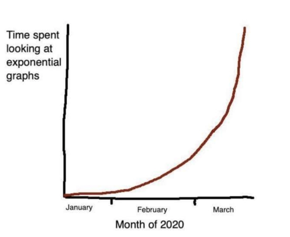
In the beginning of the COVID-19 pandemic, a joke about “time spent looking at exponential graphs” circulated on social media.

This was surely a time of graphs, charts and curves. Uncertainty made people search for signs, trends and tendencies. Something to hold on to. Credible prognoses. How would it all develop? What could we expect to happen? Would we be able to “flatten the curve” of registered COVID-19 cases and deaths? Would the curve go up, would it go down?

What is this imaginary surfing along curves? Diagrams, charts and graphs. Plots, points and grids. All these abstract representations. Notions of time and some other factor. X- and Y-axes. An imaginary line takes form. It is said to show how something changes over time. Giving direction, capturing the orientation of minds and collectives. Moving, bending, twisting, curving.

A graph can of course have different shapes. A common and widespread version is the S-curve. A shape imagined to show how something changes slightly at the beginning, then how change speeds up exponentially. The curve becomes steeper. Rising towards an imagined top, onward and upwards. Then it gradually becomes almost horisontal. A continued movement towards the right. Moving forward? Progression of time without any notable growth or increase.

The S-curve has been used to show how innovations are spread, how consumers or user adopt novelties.[1] It pictures how, first a smaller group of early adopters are influenced, starts to use or take on something. It all depends on what is counted, but the shape of the curve is more or less universal. After the early adopters comes the majority. Now the curve becomes steeper. Rising upwards, for good or for bad, depending on what the curve represents and who is looking at it. The majority is followed by laggards, the ones coming in late.

The S-curve has been used to show everything from the dissemination and dispersion of certain tools, like rakes in the Swedish countryside during early 20th Century, to the spread of Internet connectivity around year 2000. Twenty years later curves similar to the S-curve were utilised to illustrate virus infections and the development of the pandemic. Seldom have so much statistics and numbers been transformed to curves and graphs, then projected, disseminated, discussed, used, interpreted and misinterpreted.

The chart and the curve. Their suggestive power comes from the simplistic imaginaries they evoke. Complex processes and conditions transmuted into visual objects and shapes within the frame of a chart. Organised in a grid. Representing amounts, levels and size. What is off-grid does not exist in this evocation of a demarcated reality. Straightforward and easy to address as supposed evidence and as weapons of argumentation and persuasion.

Also the sequentiality of curves. The progression and an envisaged one-way direction of change. This is how reality is depicted and collectively imagined in many parts of society. In board rooms, in class rooms, at conferences and meetings.

The use of tools and cognitive aids to imagine, communicate and do knowledge work does of course have a long and multi-faceted history. In a review essay of Reviel Netz’ The Shaping of Deduction in Greek Mathematics: A Study in Cognitive History (2003) Bruno Latour stress the importance of scripto-visual inventions and quote Netz:

I will argue that the two main tools for the shaping of deduction were the diagram, on the one hand, and the mathematical language on the other hand. Diagrams – in the specific way they are used in Greek mathematics – are the Greek mathematical way of tapping human visual cognitive resources. Greek mathematical language is a way of tapping human linguistic resources … But note that there is nothing universal about the precise shape of such cognitive methods. They are not neural; they are a historical construct … One need studies in cognitive history, and I offer here one such study. (pp. 6–7)

Reviel Netz’ The Shaping of Deduction in Greek Mathematics: A Study in Cognitive History (pp. 6-7) as quoted in Bruno Latour (2008) Review Essay: The Netz-Works of Greek Deductions. In:  Social Studies of Science 38 (pp. 441–459)

Here Netz highlights the diagram as a tool for the shaping of deduction, arguing that practices like, what I here call, curve surfing have been crucial collective cognitive techniques. Latour continue to reflect on Netz´ argument:

As can be seen from this quotation, Netz’s materialism is not to be found as in some ‘social construction of mathematics’ in the economical background of classical Greece, but in the intellectual technologies in which so much of science studies today consists. How do you demonstrate something to someone? That is, how do you show it? How do you draw it? How do you point your finger at it while speaking? How do you letter it? How do you gain assent in the absence of your correspondents? How do you share conviction?

Latour, Bruno (2008) Review Essay: The Netz-Works of Greek Deductions. In:  Social Studies of Science 38, pp. 441–459. page 443.

In the spring 2020 and more or less the rest of the year, diagrammatic visualisations were brought up at Corona-press conferences led by authorities as well as in the informational flows in online media. An abstract ride along a curve was imagined and evoked. This practice of curve surfing is one of the most central orientational concepts of modern society. A virus induced an epidemic of curve surfing. A practice that we can trace back to practices of formalism and mathematical deduction thousands of years ago. An imaginary about a common collective journey. Where are we heading, how will it be? We’re on a road to…? Surf’s up, catch the wave of change and ride along. 


[1] The S-curve appear in Everett Rogers’ Diffusion of Innovations (1962), see the post: From Early Adopters to Early Alerters. Several innovation imaginaries evoke change as “the march of new technology”, disruption, technological evolution and “inexorable progress”. The way I address emerging technologies through ideas about mundanisation is however more aligned with ideas about temporal entanglements as discussed by Shannon Mattern in Code and Clay, Data and Dirt (2017). By combining methods from archeology and media-archeology she stress the importance of local variations of media, of different temporalities and evolutionary paths. This create methodological opportunities to study media that also “…necessitate an alternative means of writing history – one that looks beyond revolutions, Great Men’s accomplishments, origin stories, and reductive distinctions between “old” and “new””(Mattern 2017:xxviii) .


Version History

V. 1.1 June 6 2020. Added a paragraph about the suggestive power of charts and graphs. Added an image of diagram-templates, and a part in note 1 referring to Shannon Mattern and her methodological arguments about studying media. Smaller typographic adjustments.

V. 1.2. October 11 2020. Added a quote by Bruno Latour, in which he discusses cognitive tools for deduction, based on Reviel Netz studies of deduction in early greek mathematics.

Categories
The Mundania Files

From Early Adopters to Early Alerters

In 2020, during times of sudden enforced physical distancing, people searched for ways to connect socially through new digital services and devices. Adoption of technological novelties became rampant. Transformation abrupt. People searched for new tools, new habits took form. Technological change seeped into everyday life.

These are times when the ones embracing new technologies get attention, when they might act as influencers for a majority searching for new technologically generated solutions and opportunities.

In come the early adopters, sometimes considered the heroes of innovation economies, the avant garde, the pioneers, the trail blazers. Sometimes called Lighthouse Customers or even Alpha Consumers. Embracing the new. Taking some kind of risk by engaging with beta-versions and early versions of technologies under development. The early adopter-concept come from Everett Rogers’ ideas and book about Diffusion of Innovations from 1962.[1] The ideas do not expound on social and cultural complexity and various irregularities that can be related to technological change. But based on a simple and straightforward model the theories are very persistent and remain widely used to describe the processes around emerging technologies.

Adoption is not that far from adaptation. Both words point at a transformative process. Some new element is introduced in an (ec0)system and it changes what was there before. The change can be slow and barely unnoticably, or it can be dramatical. New conditions, opportunities, threats and after a while also new habits and routines.The early adopters are ready to take on this transformation, to adopt a service or device and to also be adapted to a system. Early adoption is often promoted as a proactive manoeuvre, an acquisition or takeover. But it is often disregarded that it is also a submissive action. Adoption is to some extent adaptation, a defiance, acceptance and submission to a system or technology.

Splinter

There are other ones than the early adopters in the landscape of technological change and innovation. People not necessarily intentionally taking risks, but being put at risk. In times of widespread technological change, we should raise our gaze and look at not only early adopters but also at early alerters. The ones telling us about the inherent maladies and defects of an emerging system or technological innovation.

Within a system focused on social and technological transparency, a system fetishising  limitless sharing of information, we certainly find the early alerters. The people being put at risk by the very system, by enforced transparency. The people not following norms, challenged minorities, dissidents. People that for some reason are not accepted by a majority. People for whom total transparency can be a lethal risk.

If you are part of a minority, you can seldom be totally transparent with what you are doing and what you are feeling and expressing. As long as a majority does not totally accept minorities, secrecy in itself is a treasure. Secrets something to hold on to. Transparency breeds uniformity, the following of rules. Often this is something good, but sometimes it is bad. Uniformity and rules are seldom compatible with everyone.

Cage for reviving canary, with oxygen cylinder, made by Siebe Gorman & Co. Ltd, London. Photographed 3/4 view on a white background.

The early alerters are the canaries in the mine, warning also the majority about an invisible risk that is evolving in the atmosphere. A risk that is invisible to the ones without the involuntary abilities of the early alerters. We should not consider early adopters as trail-blazing heroes without also recognising and listening to early alerters.


[1] Rogers, Everett (1962). Diffusion of Innovation. Free Press of Glencoe.

Categories
The Mundania Files

Mundania 2020


¶ From early 2020 COVID-19 sparked a time of disruption. What had once been normal was renegotiated. When The Virus started to spread, the conditions of Mundania were challenged. Some patterns of everyday life were transformed and new ones emerged. New imaginaries took hold. Social distancing and proximity, mobility and domesticity, as well as offline-integrity and technological connectivity had to be reconsidered. 

This image has an empty alt attribute; its file name is Hotel_heart-1024x768.jpg
The light art appearing on hotel facades in 2020 had a warming message, but the background to it was empty hotels, facing a crisis.The absence of guests gave the possibility to use windows as points of light or “pixels” to create a symbol. Photo from Park Inn by Radisson, World Trade Center in Lund Sweden.

¶ When futures are uncertain. When structures and systems are in flux, we need new concepts, new methods, new approaches and hybrid forms to orient ourselves. Mundania is one attempt along these lines. By framing the way emerging technologies disappear into everyday life as a process of mundanisation, curiosity and the wayward can be put at the forefront. New thoughts can hopefully be provoked in academic fields already characterised by an abundance of theory and studies. 

¶ The Mundania concept can be related to discussions within some different contexts. Although the academic disciplines studying media, technology and everyday life is a densely inhabited and yet dynamic field, we still need new approaches to understand how the sublime, the thrilling, the unexplainably complex become part of bland and boring everyday life. How do emerging technologies turn from vaporware, via novelties to invisible and ignored infrastructure? Why are some technologies successful and others not? And what does success really mean here? Malevolent technologies are also becoming part of the obfuscated fabric of everyday life.

¶ Since the 1990’s the word domestication has been used to describe how technology is incorporated in user’s everyday life.[1] It captures how technology is adopted, how negotiations take place, and even how users may affect future strategies of producers. But we still need a word for the processes through which incomprehensible complexity is turned into the ordinary, a word saying something about how layers between ominous complexity and commonplace everyday life are engendered when technologies are habitually used. Because this is not about something wild becoming domesticated or tamed. It is not about something wild becoming tamed and domesticated.

¶ Complex technologies are only seemingly converted step-by-step into controlled parts of everyday life. Where are the ends of control? How are dependencies engendered? Mundanisation is an attempt to address these questions. It is meant to capture how complex arrangements of technologies and human organisation maintain its incomprehensible unmanageability while still being transmuted into the ordinary, the mundane, the commonplace in people’s everyday lives.  Normalising what before, or at its introduction, was seen as impossible, frightening or fantastic. 

 Mundanisation is basically characterised by two principles. Technological and organisational workings can firstly be obscured “by design”. Black-boxing of technologies and intentional seclusion of operations take place “under the hood” (Pasquale 2015). Media scholar Lisa Parks has called this phenomenon “infrastructural concealment”[2]. Mundanisation is also evoked by the very everyday use of technologies and things (Highmore 2001; Löfgren 2015; Shove 2003). This is the ignorance that is engendered when things become parts of unreflected patterns of behaviour. These two parts reinforce each other. 

¶ Mundanisation has happened for a long time. It is how routines, habits and patterns of everyday life are formed. The processes of mundanisation have become more easy to recognise in modern and industrial societies. Widespread standards, the prerequisite for industrialisation, shifts knowledge in the head to knowledge in the world, to use the words of design theorist Donald Norman. Precise behaviour can emerge from imprecise knowledge.[3] You don’t have to learn exactly how standards and protocols are assembled and organised to use them. A USB-C-connector will fit another USB-C-connector. You don’t even have to be able to descibe how it looks. This is the logic of standardised systems. You can use a coin without remembering exactly how it looks. Heads or tails? King or queen? Statesman or animal? Just remember the size, material and how it feels in your hand. When something is standardised, it should “just work and fit”, without you having to think about it. 

¶ Power buttons and all the hidden wirings and connections, then followed by radio transmissions, moving images on screens, software and satellites, The Internet and The Clouds. Data centers and protocols. AI, “smart” things, homes and cities. It is all there, yet most of what manifests it is obscured. The continuous supply of electricity has been flowing mostly unnoticed for decades. Now, during the first decades of the 21th Century, new layers of technology are becoming ambient. More and more GPS-based services, online shopping, camera surveillance, machine learning and ever-present touchscreens. Infrastructures and interfaces. Technologies harnessed by software, enmeshed through the logistics of wired as well as wireless networks. Utterly complex systems are seamlessly intertwined with people’s lives.

¶ When technology and infrastructure work, it is experienced as a backdrop to life, as ambient, part of the atmosphere, as uncomplicated parts of daily practices. Technology becomes woven into, what geographer Nigel Thrift has called, epistemic wallpaper.[4] Infrastructures, supply-chains and distributed power relations are rarely reflected upon when technologies have been effectively integrated in everyday life. Like wallpaper, it is just there, while we are doing whatever we are doing.

¶ Services, things and technologies can start as something utterly fascinating, as something awkward or even disquieting. Then they disappear in the muddle of everyday life, they become almost impossible to bring up in discussions or small talk. At some point in the life cycle of a popular technology, extensive critical reflection and discussion seems to vanish. Even though there are obvious risks and uncertainties, many technologies are still used. They are considered as normal. We need to know more about when and how this really happens. Despite wide-spread awareness about potential threats, these are ignored. When technologies become part of routines and habits, large parts of technological assemblages and organisational operations are constantly ignored. Until something happens. Like a virus. Something that force us to renegotiate, reconsider and reimagine.


[1] The use of the word ”domestication” in relation to media appeared first in: Silverstone, R., Hirsch, E., & Morley, D. (1992). Information and Communication Technologies and The Moral Economy of The Household. In: R. Silverstone & E. Hirsch (Eds.), Consuming Technologies: Media and Information in Domestic Spaces (pp. 115–131). London: Routledge, and have subsequently been used and developed in a number of scholarly contexts. See eg. Berker, T., Hartmann, M., & Punie, Y. (2006). Domestication Of Media And Technology. London: Open University Press.

[2] Parks, Lisa (2012): Technostruggles and the Satellite Dish: A Populist Approach to Infrastructure. In:  Bolin, Göran (Ed.). Cultural Technologies: The Shaping of Culture in Media and Society. London: Routledge 64–84.

In an interview Parks expound on her interest in infrastructural invisibility and concealment. She describes how she became interested in the topic and also stress the social and gendered dimensions of technological visibility.

My interest in thinking about infrastructures and their ‘invisibility’ was born out of a recognition of my own socialization not to notice them. Over time I have become increasingly aware of technological objects in the built environment that are relevant to global media economies – telecom towers, satellite Earth stations, data centres and other infrastructure sites. I learned the language of cinema. I knew how to read a TV text. But I did not really understand the mechanics or physical arrangements of systems used to distribute audiovisual content to screens or interfaces. It was that moment of recognizing that this was really a problem of disciplinary training and knowledge, but also of gendered socialization. 

Parks, Lisa (2019). Televisual epistemologies and beyond. In: Journal of Visual Culture18(2), 234–249. Page: 241.

In the interview she also advocates artistic approaches to imagine and visualize complex infrastructures. She also points out a risk that the quite broad interest in the studies of media infrastructures can lead to a kind of scholarly entropy around the concept.

There are now quite a few young scholars and graduate students interested in researching and theorizing various aspects of media infrastructures. With any concept or sub-topic in a field, an entropy can start to set in when lots of people gravitate to a concept at once. Suddenly, the term starts to become overloaded and not as useful any more. I argue that we need to have more sub-level concepts in media infrastructure studies, concepts that help to account for the diverse socio-technical relations that materialize media infrastructures in different parts of the world.

Parks, Lisa (2019). Televisual epistemologies and beyond. In: Journal of Visual Culture18(2), 234–249. Page: 242

My work with Mundania and processes of mundanisation is one way to move along with studies of the infrastructural and to see where these concepts might lead.

[3] Norman, Donald A. (1998): The Design of Everyday Things. Massachusetts: MIT Press. See also: Willim, R. (2005). MenuingEthnologia Europaea. Journal of European Ethnology35(1–2), 125–129.

[4] Nigel Thrift discussed epistemic wallpaper as part of arguments about how technologies relates to thinking and spatial awareness. Thrift, N. (2004). Movement-space: The changing domain of thinking resulting from the development of new kinds of spatial awareness. Economy and Society33(4), 582–604. https://doi.org/10.1080/0308514042000285305 See also: Bowker, Geoffrey C. and Star, Susan Leigh (1999), Sorting Things Out: Classification and its Consequences (Cambridge Massachusetts: MIT Press).

Version History

V. 1.1 June 16 2020. Added reference to Lisa Parks and her work on infrastructural concealment and visibility, see note 2. References to Bowker and Star and Peters added.

V. 1.2 November 19 2020. Reference added to Highmore, Löfgren and Shove, and the discussion on domestication was slightly modified.